The approach
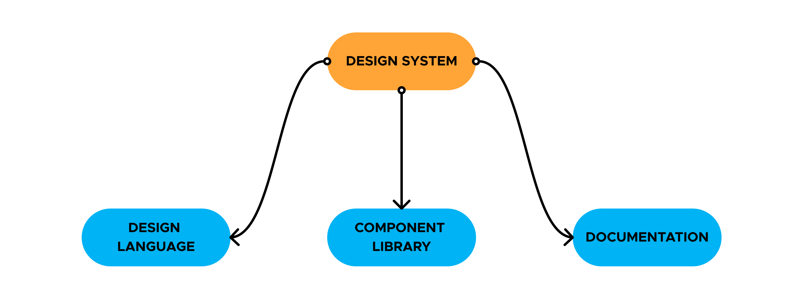
In order to have a truly complete design system, you need to have 3 main components. These are the foundational building blocks to creating a design system:
- A design language
- A component library
- Documentation
I started working at Mozilla in 2021. The privacy and security org was small, and I started working in a team of 6 talent UX people. Mozilla VPN was a relatively new product, and our other products were still only in the “freemium” phase.
We knew the team would be growing, and the need for design consistency would soon be a priority. We knew we needed a design system, and having built a design system at my previous company, my task was to own the creation of an org-wide design system from scratch.
Before starting, I had to determine the product and business goals. This included internal interviews with the design team, engineering team and managers. I needed to understand their business goals and our product goals.
I owned and led this initiative as the sole designer. I was responsible for research, execution of the visual assets and documentation. I also worked together with a team of 10+ talented UX people to create a design language that would be the foundational piece to everything we do.
The design system launched company-wide in early 2022, and the design language launched in early 2023.
In order to have a truly complete design system, you need to have 3 main components. These are the foundational building blocks to creating a design system:
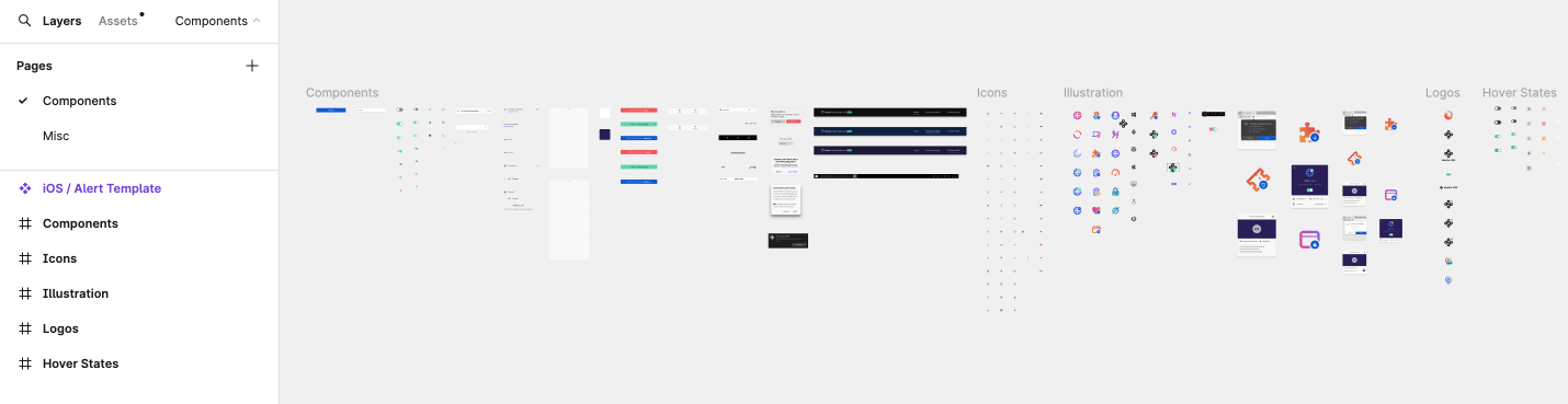
Before starting any work on a new design system, I had to lead an internal audit of everything we had in Figma. Long story short, we didn’t have much. What I did find was that the entire org was working with an extremely limited figma file of loose components akin to a small UI kit.
After cataloging and organizing what items can be salvaged and reused, I was able to start working on reimagining our team’s new design system.
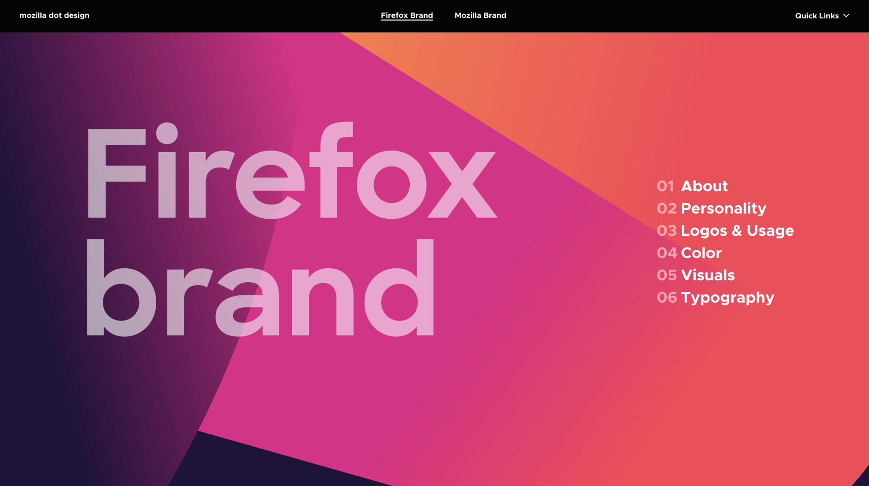
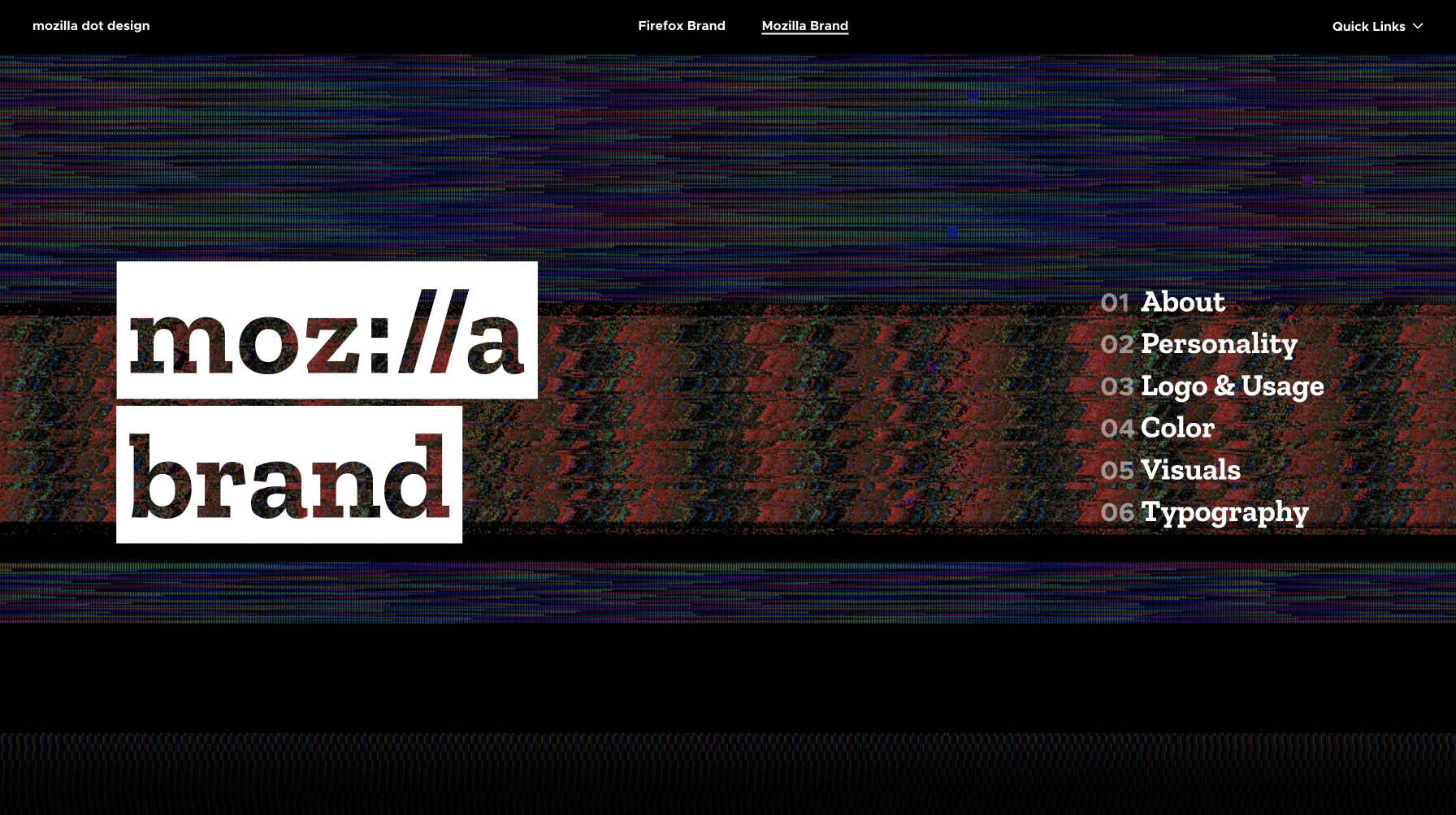
I also looked at our company branding and other design systems and brand guidelines within the company. We had the Firefox brand guidlines and the Mozilla brand guidelines. Our products borrowed from both of these resources, so it required the creation of something new.
The Mozilla brand has a design system called Protocol that was used for mainly marketing related web surfaces, the font sizing, line height and font weights would all be reused in our system. The only thing we would change would be the font pairing. We would use the same font-families used in the Firefox design system - the Firefox fonts are more UI friendly. I worked with engineers to add design tokens that matched the CSS classes within the codebase to create consistency between the design and the code.
Another thing we were able to salvage from the previous system was the colour palette. We essentially used the same palette as all Mozilla/Firefox products, with a few additions. The lead designers for all of the core “Privacy and Security” products worked together to create primary color palettes for each product, and use these primary colours to inform minor tweaks to the larger, more robust secondary palette.
I organized these coponents by device (Web vs. mobile) since our products were either web-apps or cross-platform apps. I also made sure to categorize them using Atomic Design Principles as a guide.
The previous UI Kit did not have any variants. I was able to take each component and create 1000+ variants. This made it inifinitely easier to display state in our designs without having to recreate the components over and over.
Another upgrade I made to the system was utilizing variables. This would allow us to modify components without having to detatch the instance. For example, adding icons to the left or right side of buttons.
Since we were scaling this design system to be used by 4 products, I needed to make these components adaptable. Using autolayout, I was able to make responsive components that we could resize to whichever viewport we were designing for.
A design system is the source of truth for your company's visual design language. I worked closely with UI engineers to realize their main goals for the design system:
A design system is more than just a UI Kit. Every UI component would have detailed usage documentation for designers, engineers or any team members to understand. We were in the process of moving our documentation to a documentation site called supernova, but it never materialized due to layoffs.
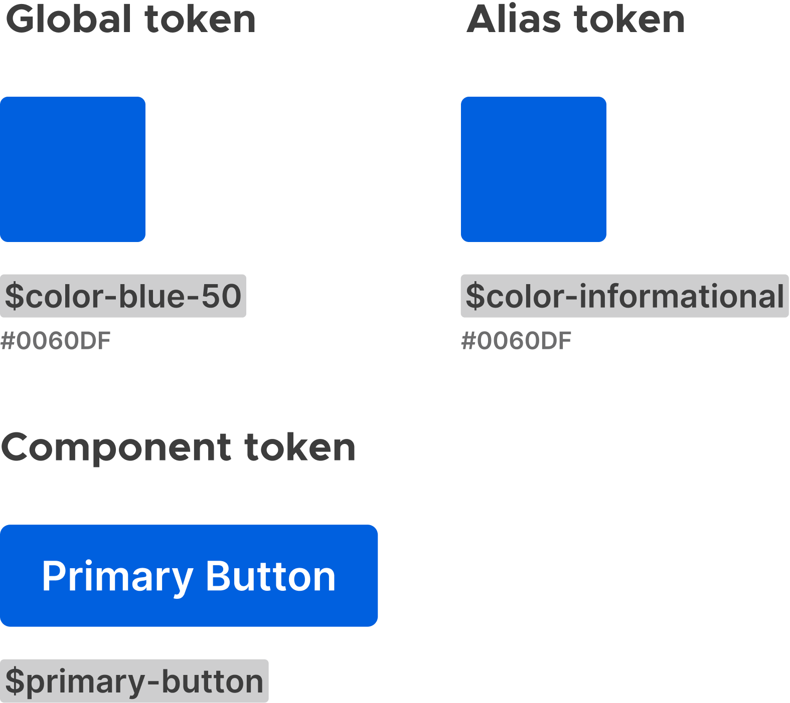
Design tokens are an integral part to creating a cross-functional design system. I worked with the engineers from multiple products to understand the naming conventions of their CSS classes. Using those classes I was able to construct design tokens that would easily match those CSS classes to create value for both designers and engineers.
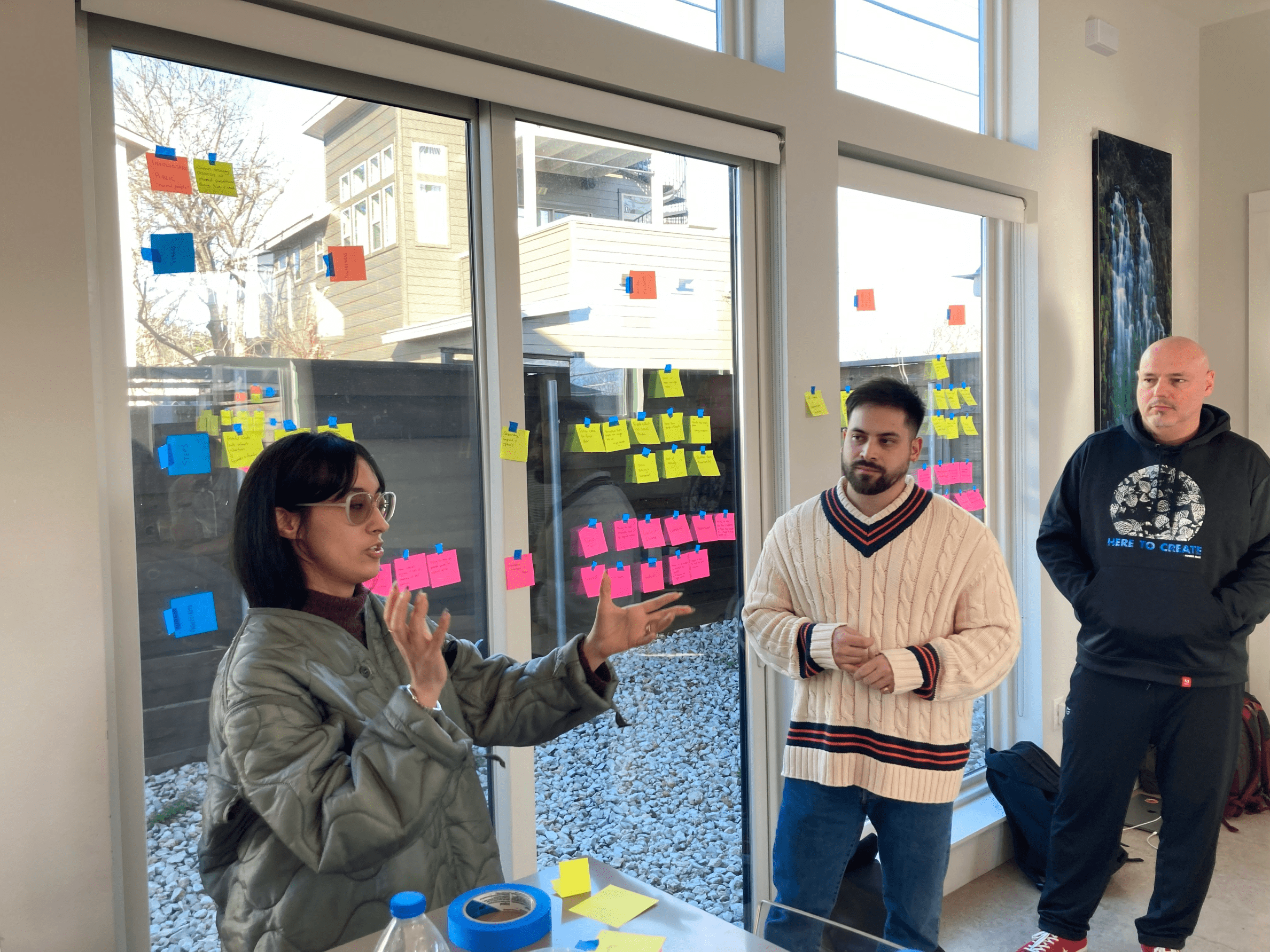
The Privacy and Security UX design team traveled to Austin, TX and during this work week, one of the main items of work we needed to accomplish was to create design principles. These principles would be the foundation of our design language, and round off the last pillar of our design system.
It's about being empathetic and connecting within the community.
Mozilla is rooted in community involvement and growth. People should experience our Privacy and Security as a part of their everyday life and circles. Our products should empower people and meet them where they are. It's not open when things are overly constraining, require expertise, or do not provide a path forward.
It's about adapting to change, offering flexibility and freedom.
We strive to guide people to the joy of the internet. Our products should provide memorable experiences with exceptional quality. We want to go above and beyond other privacy and security services to provide a flexible end-to-end experience. Nobody should feel overwhelmed or helpless.
It's about changing the perspective and crossing new boundaries.
Mozilla is optimistic about the future of the internet online and digital experience. People should be motivated to explore and express themselves online. Our products should positively transform people's attitudes and behaviors towards privacy and security. We strive to offer privacy and security with convenience, not as a tax.
Although we had already launched the visual components of the design system much earlier than we created our core principles, the completion of this work felt extremely validating for our team. I think the impact goes much deeper than increased design efficiency and consistency, but it solidified us as a real org within Mozilla. Here are my “some data, mostly vibes” impacts: