Overview
Project Details
For this Case Study, me and two other designers chose two task flows to analyze on the Uber Eats app. The first flow is the main flow where a user is ordering food and the second flow involves a user seeking help. We used Jakob Nielsen's 10 general principles for interaction design to determine the heuristics issues, and gave them a severity rating based on Nielson's severity ratings for usability problems.
PROJECT TYPE
ACADEMIC COLLABORATION(OCT-DEC 2020)
CONSTRAINTS
ONE WEEK TIMELINE
ROLE
UX RESEARCHER,UX/UI DESIGNER, PROTOTYPER
TOOLS
SKETCH, FIGMA, PHOTOSHOP,INVISION STUDIO
Research
Preliminary Research
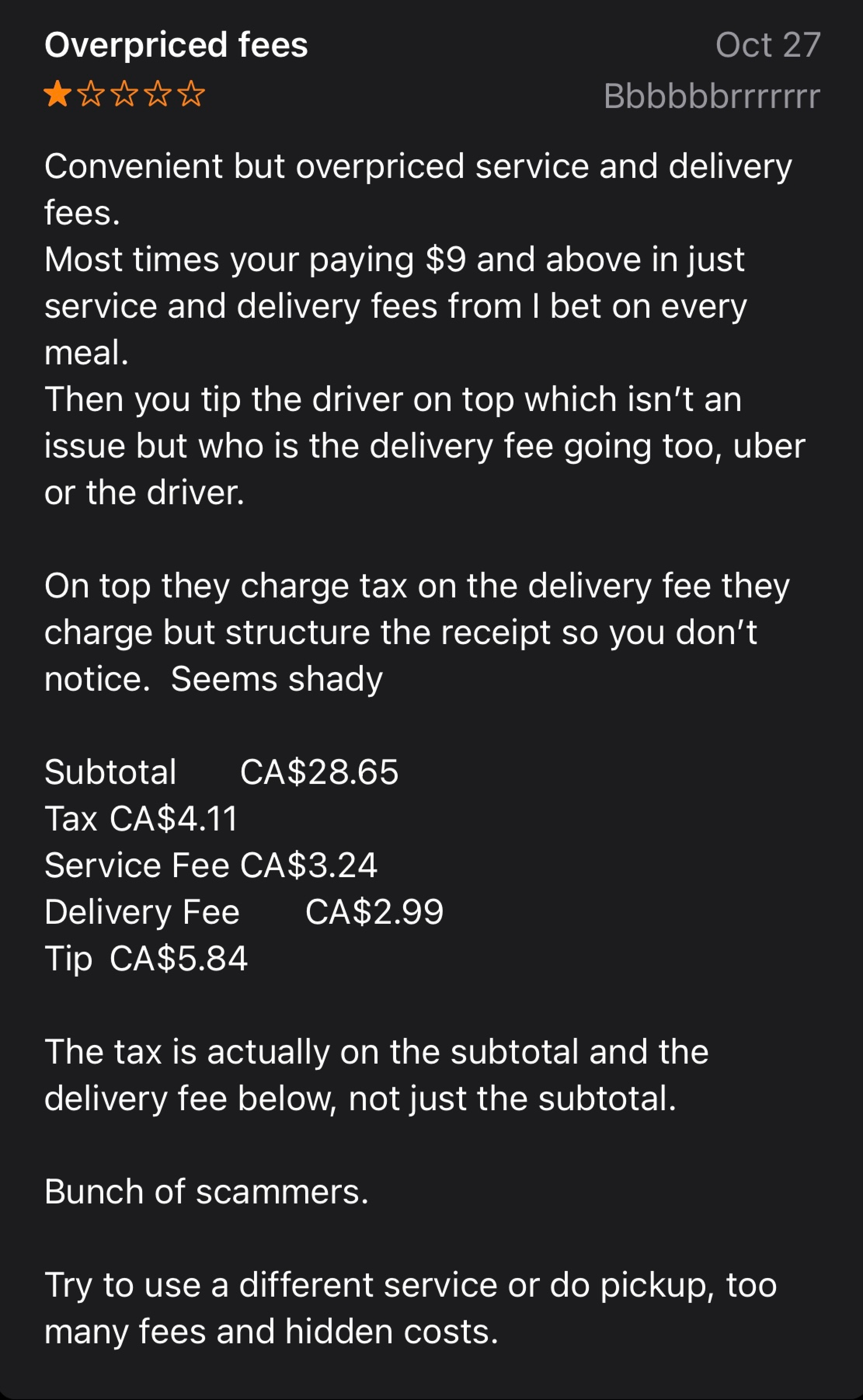
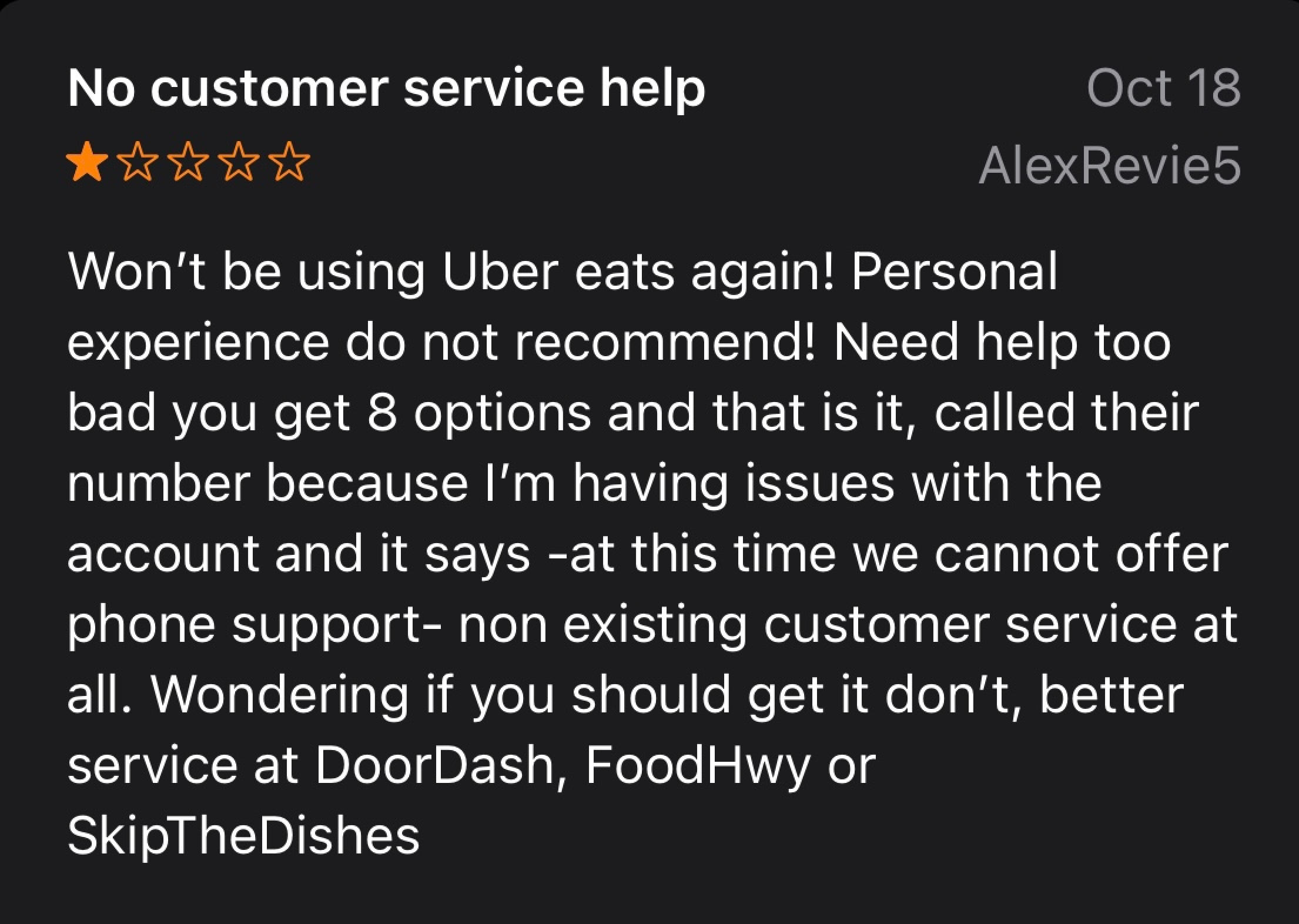
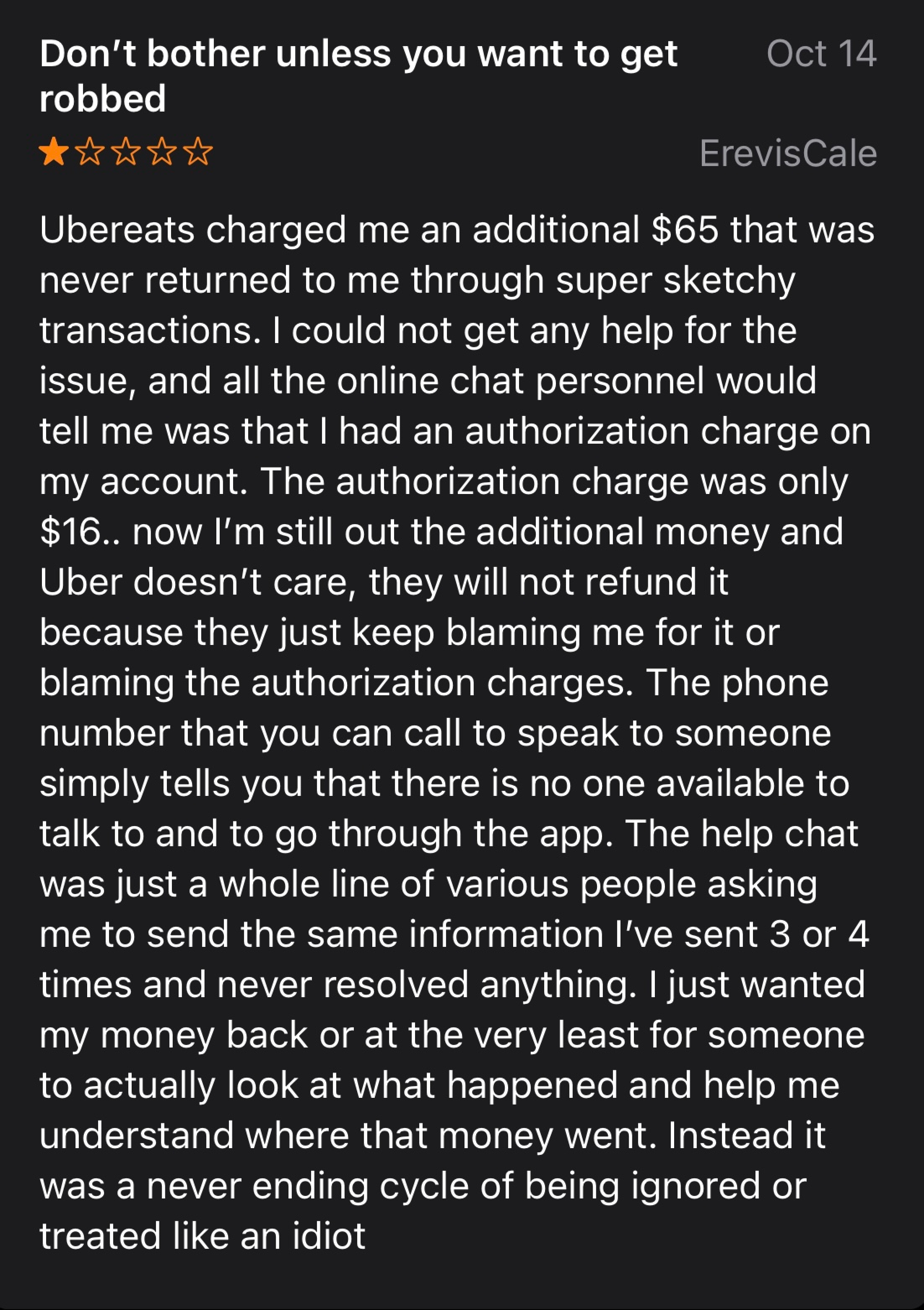
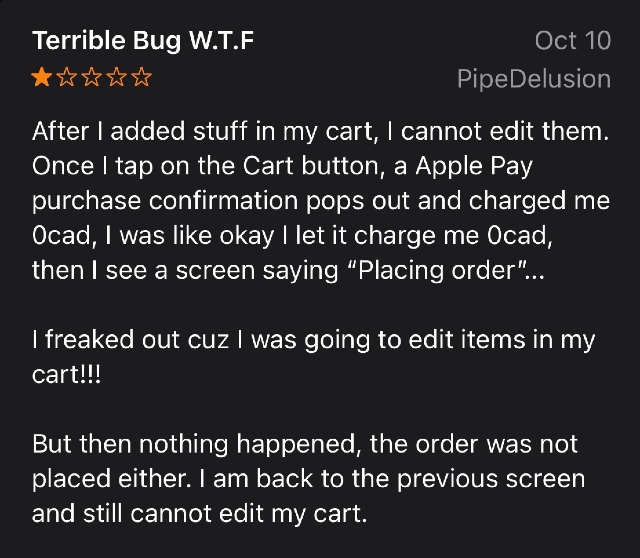
Before making any heuristic evaluations, we wanted to make sure other users had experieinced the same issues as we have with Uber Eats. We combed through the App Store reviews section and found that a lot of users had been experiencing these isses.
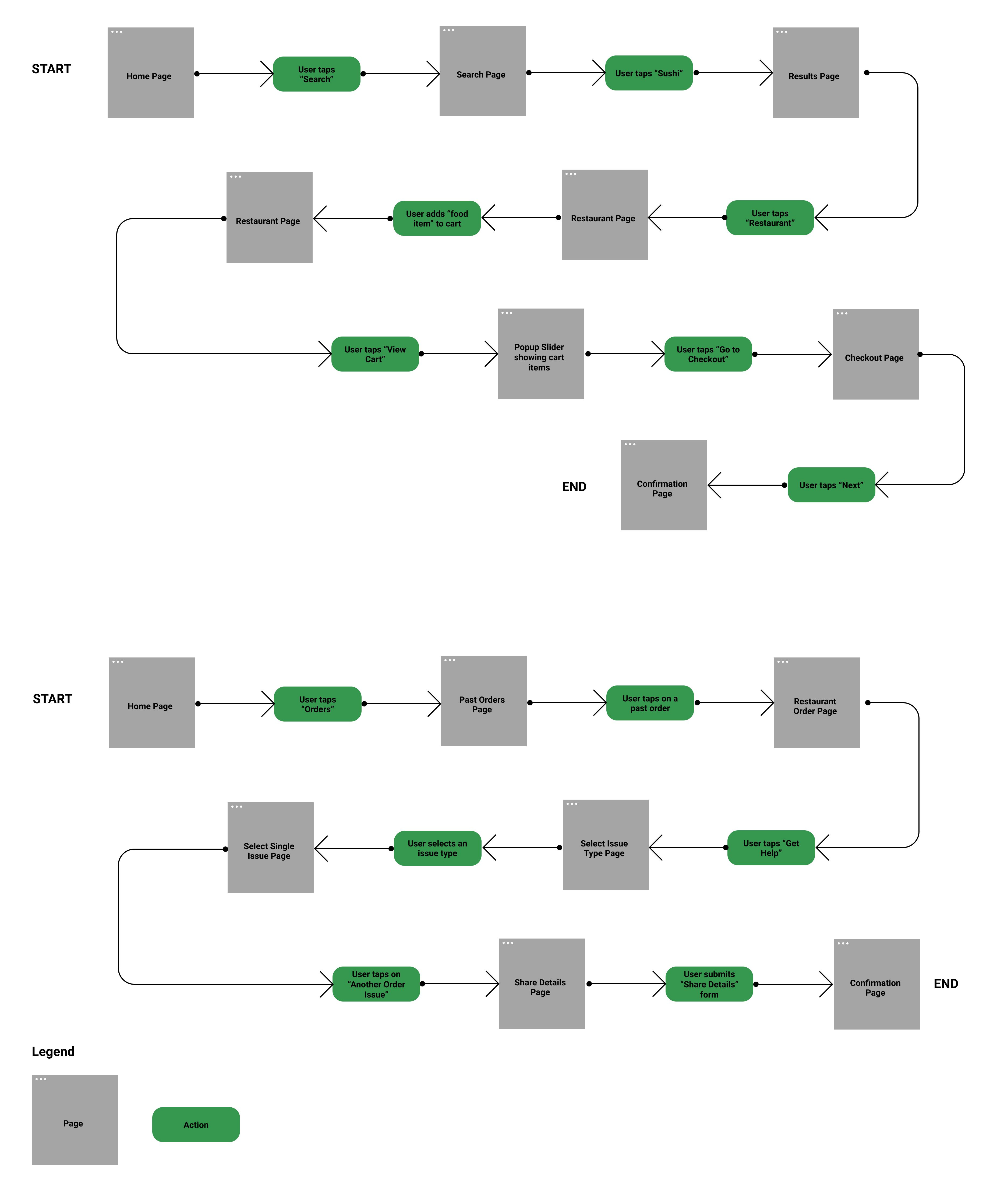
Task Flow Analysis
After confirming that that other users were experieincing the same issues with the product, we decided to analyze two core task flows for our heuristic evaluation and redesign.
- Ordering food delivery
- Getting help with a past order
Uber Brand Colours
Before jumping into the evaluation and redesign, we looked at the Uber brand UI elements to get a sense of the overall tone of the brand. Within our two task flows, both primary colours and 3 secondary colours were used throughout.
Primary

#FFFFFF
rgb(255,255,255)

#000000
rgb(0,0,0)
Secondary

#05A357
rgb(58,167,109)

#FFC043
rgb(255,192,67)

#E11900
rgb(212,67,51)
Typography
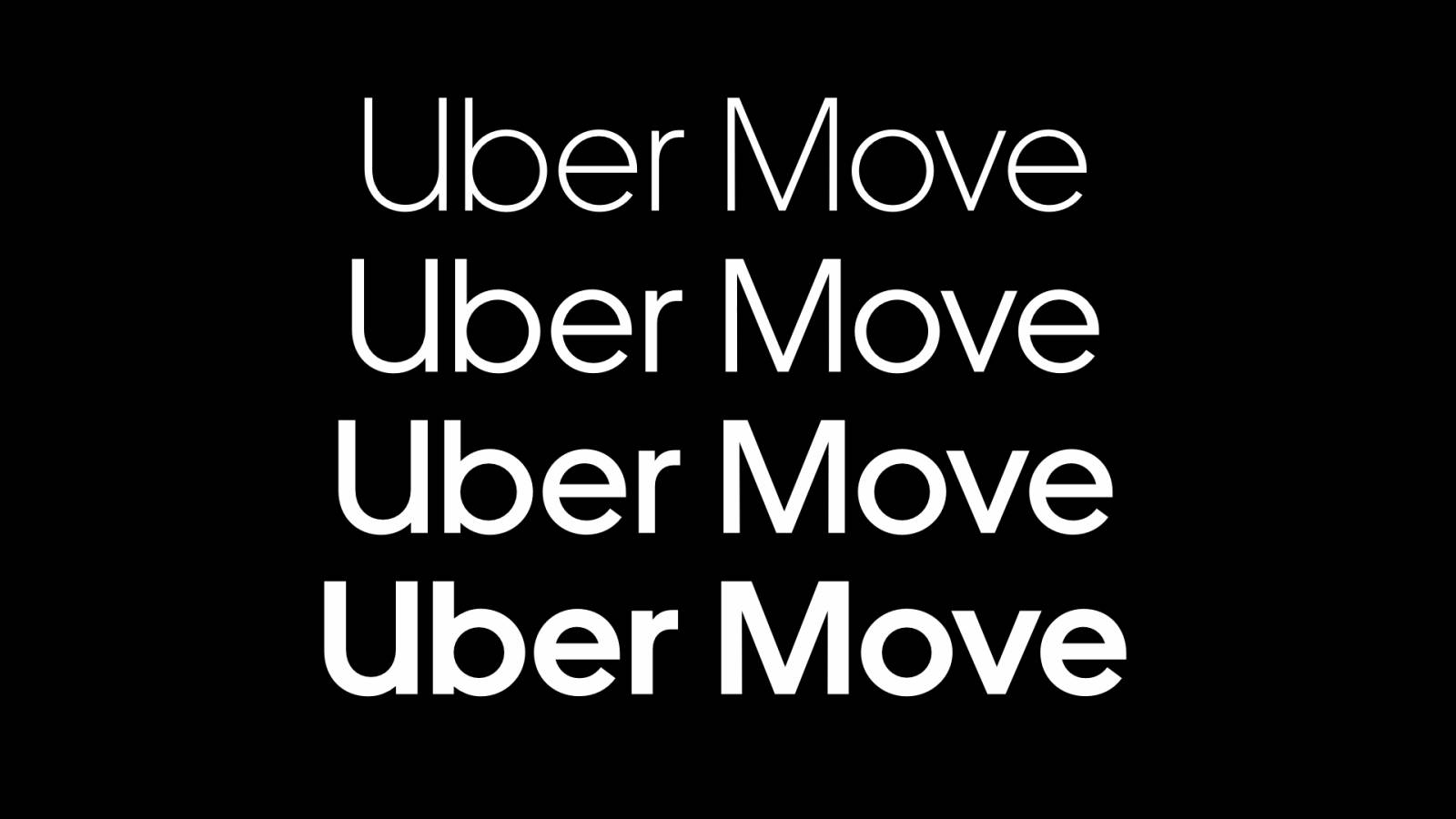
Uber uses their own typography called Uber Move. It is inspired by the world's best used transportation examples, and designed to maximize its impact across all applications while keeping it easy to read, ownable, and highly recognizable.
Iconography
There are various icons used throughout the app which vary in size, some are functional icons and some are visual icons used only for display. There are also different states for some icons, being that inactive icons are coloured #AFAFAF and active icons are coloured #000000.
Redesign
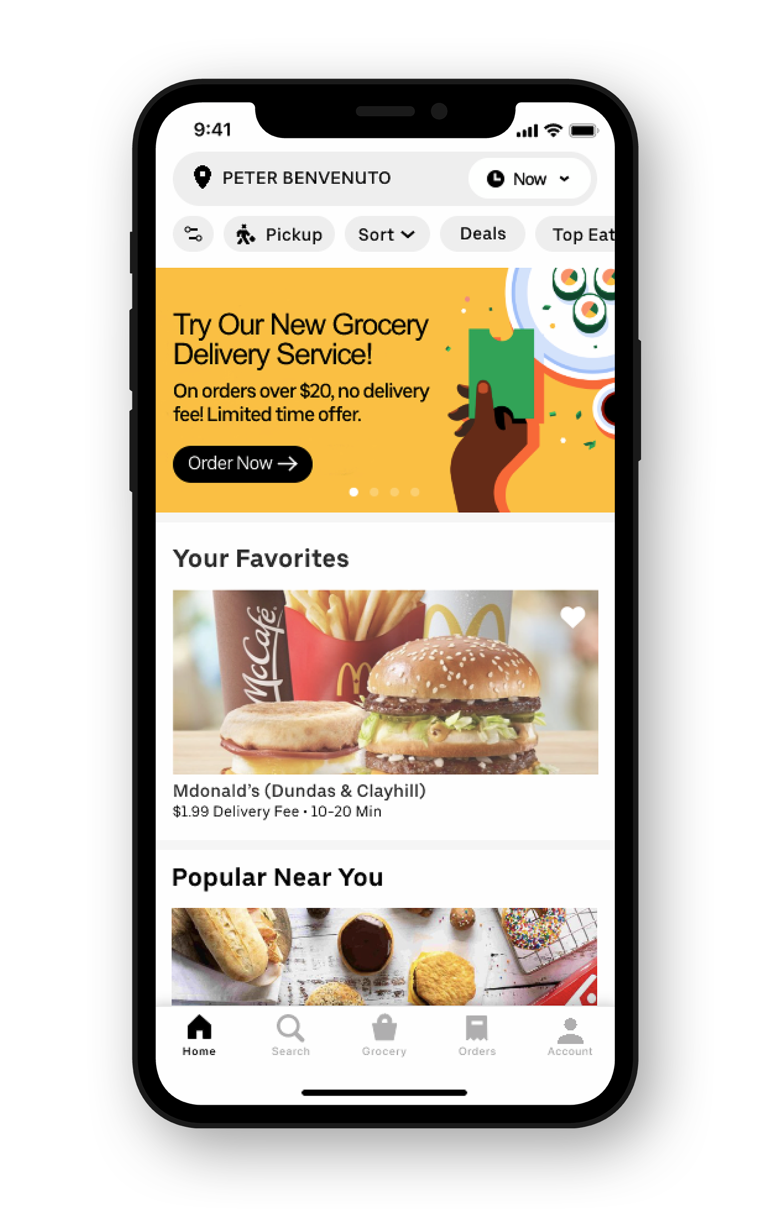
Home Page
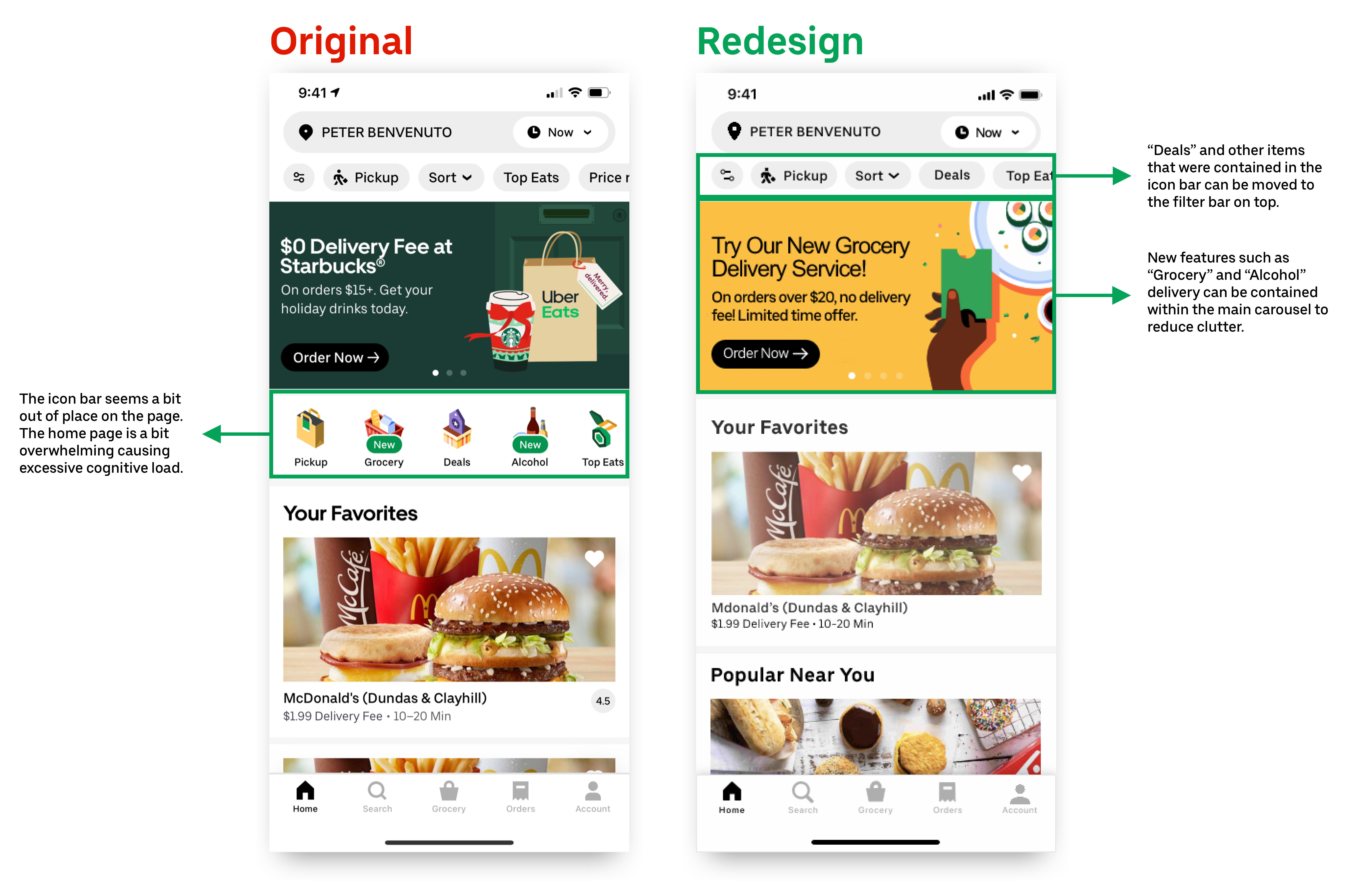
Heuristic: Aesthetic and Minimal Design
Severity Rating:
We felt that the icon bar was just adding to the users cognitive load, and by stripping the bar from the home page we were creating a more minimal look. The items on the bar can be container in both the carousel and the top filter bar, giving the page a much cleaner look.
We decided to give this a severity rating of 1 because the issue is mainly cosmetic. It doesn't interfere with the core task flow of the user and shoulnd't contribute to a high bounce rate.
Search Results Page
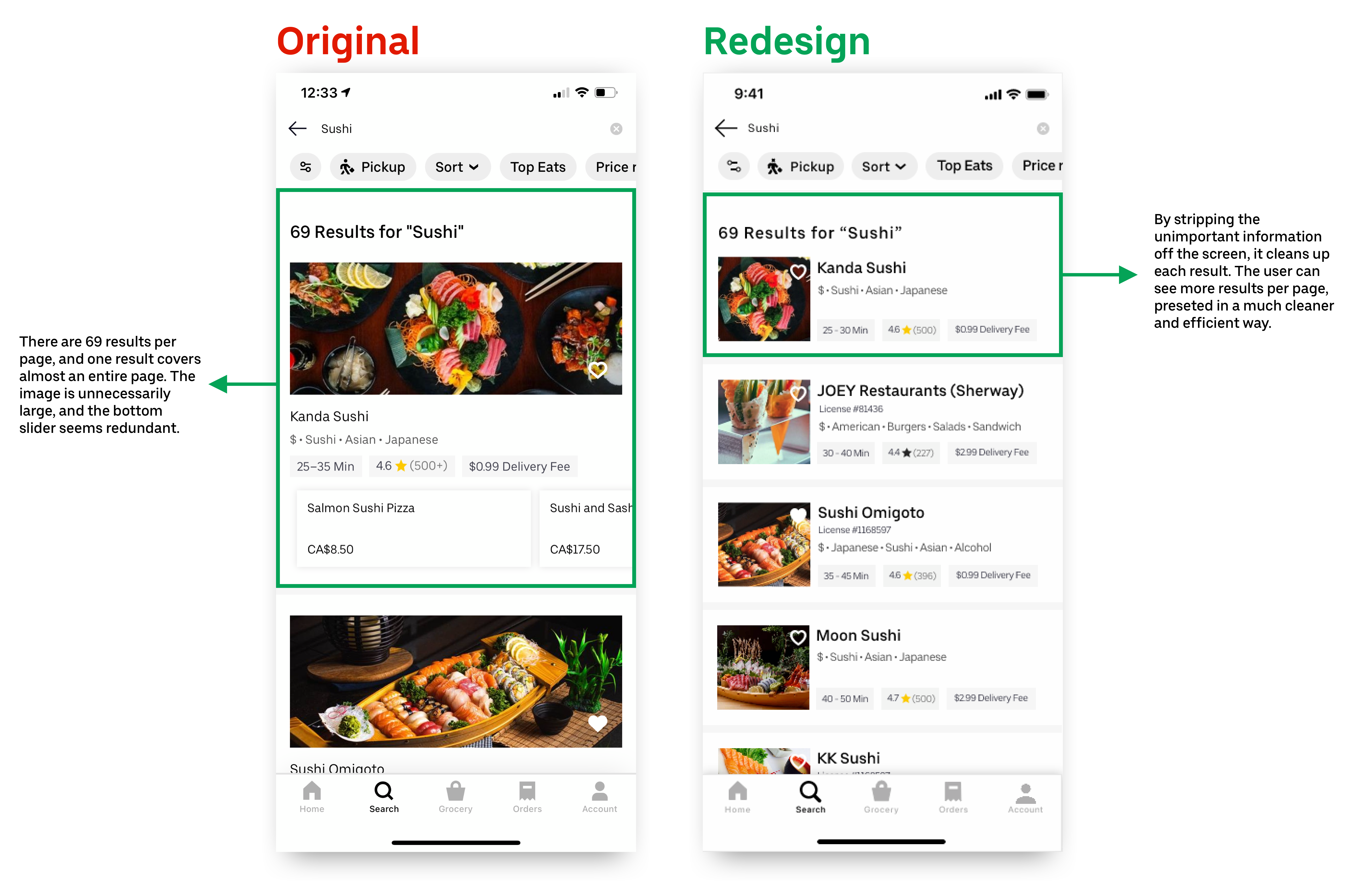
Heuristic: Aesthetic and Minimal Design
Severity Rating:
There are 69 results on this page and one results take sup almost the entire page. The slide with dishes on it seemed redundant because you can just click into the result to see those. Having a dish with no details of what's in it seemed unimportant, and having a extremely large image seemed unimportant as well you can get the goals accomplished with a smaller image.
We decided to give this a severity rating of 2 because it does marginally interfere with the core task flow of ordering food because the user may get frustrated with scrolling, and not finding something to eat. Alternatively, it also is a lower impact issue as the user can still view the results without any major issues.
Remove Item From Cart
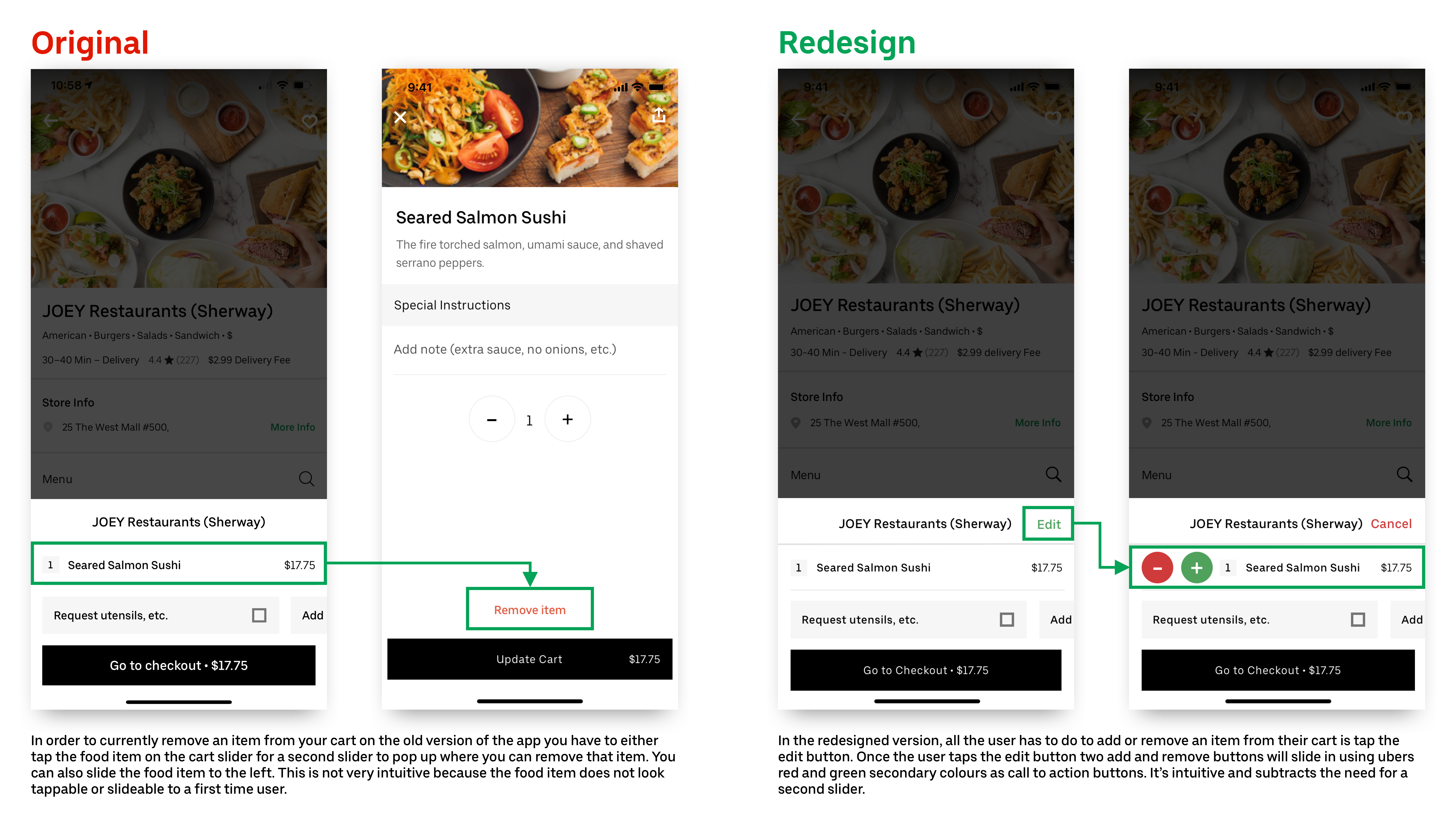
Heuristic: User Control and Freedom
Severity Rating:
Uber's current remove item flow seems a bit difficult for users who are using the app for the first time, or users who arent very tech savvy. In order to remove an item from your cart you have to either tap the food item on your cart slider, only for a second slider to pop up to remove the item or you can slide the food item to the left. Both these actions are not intuititve because the food item doesn't look tappable or slideable in the cart.
We decided to give this issue a severity of 2 because removing an item is not impossible, and the user can still remove the item if they slide the food item to the left or tap the food item. The issue is a lower impact change, and should not lead the user to leaving the app.
Checkout Page
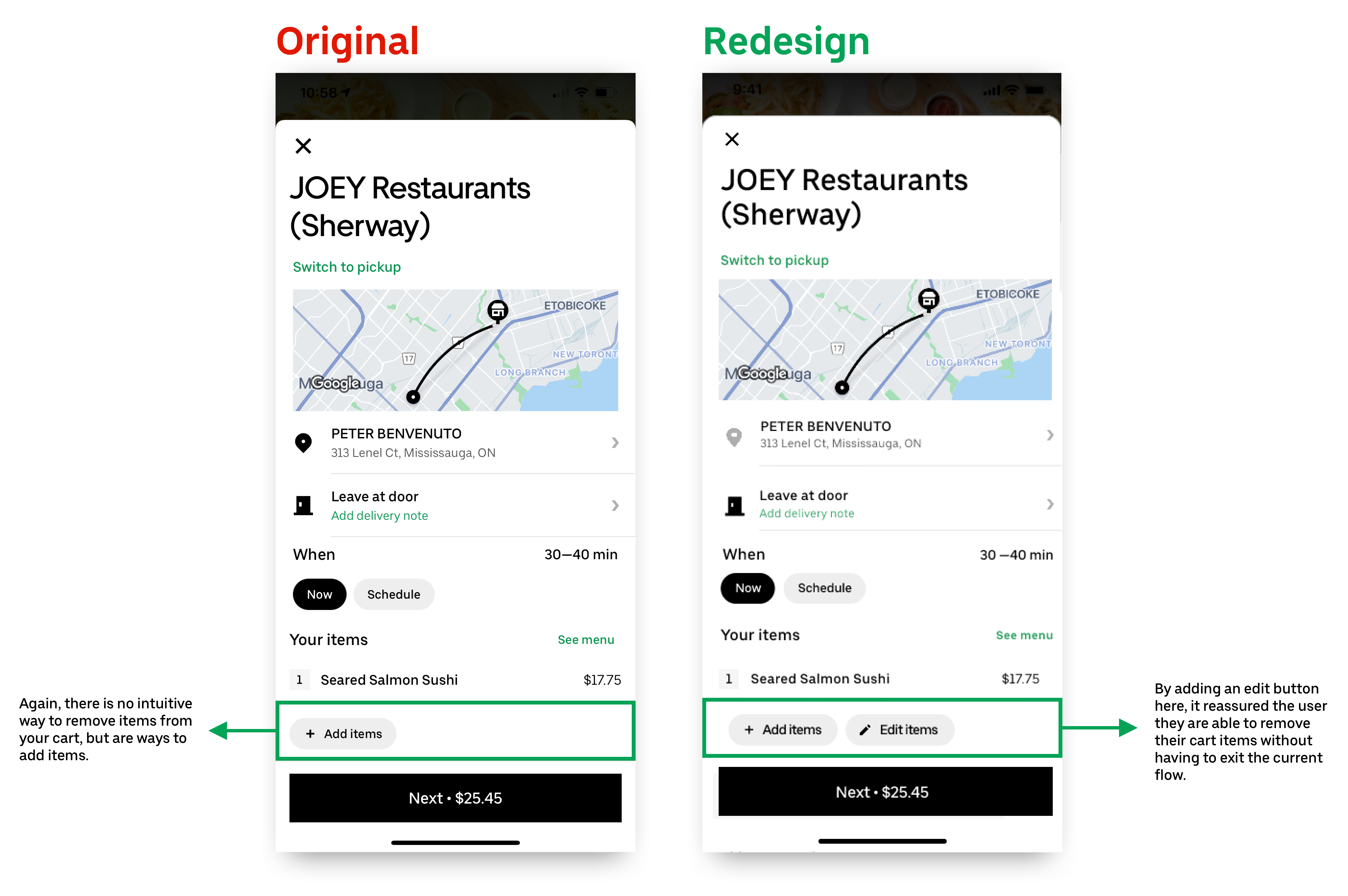
Heuristic: User Control and Freedom
Severity Rating:
On the current checkout slider, the user is able to add items from their cart intuitively, but the UI doesn't indicate an intuitive way to remove or edit items in their current cart. Adding an edit button that slides out a remove button can make the experieince that much more pleasant for the user.
We decided to give this issue a severity of 2 because removing an item is not impossible, and the user can still remove the item if they slide the food item to the left. The issue is a lower impact change, and should not lead the user to leaving the app.
Getting Help With a Past Order
Heuristic: Help and Documentation
Severity Rating:
On the current help flow, the user is forced to click through 5 different screens in order to get help from customer service, if their question is not in the FAQs. This was the biggest issue for users when going through the reviews, users where extremely upset with the process of getting help with an order. Instead of having 3 different FAQs sections, we placed them on the first screen of the flow, and if the user still needs further assistance they can choose to contact uber and send a custom message to their customer service. The flow is cut down from 5 screens to two screens, and creates a much more pleasant user experience.
We decided to give this issue a severity of 3 because this was a pretty common issue for users when looking through the reviews, a lot of users even said they would never use Uber Eats again because of this. The flow is very long and difficult to navigate, and will contribute to a higher bounce rate.
Testing
User Testing
After completing our redesigns, we decided that it was important that we test our changes to make sure they were usable to other users. I stitched together a live prototype for us to test, and together we created a test script with 3 main tasks for the users to complete as they went through the prototype. Overall, we tested 5 people and each one of them was able to complete each task without any problem.
- Order sushi from JOEY Restaurants
- Edit items in cart
- Get help with a past order from Sushi Omigato