Zenfit is a fitness app that helps users stay active and motivated, while it also helps to regulate their mood.
Try the Prototype
PROJECT TYPE
ACADEMIC (OCT-DEC 2020)
CONSTRAINTS
10 WEEK TIMELINE, NATIVE iOS PLATFORM
ROLE
PRODUCT DESIGNER, UX RESEARCHER,UX/UI DESIGNER, WEB DEVELOPER
TOOLS
SKETCH, FIGMA, PHOTOSHOP,ILLUSTRATOR, INVISION STUDIO
DESIGN PROCESS
.
Throughout this project, I referenced the Design Counsil's Double Diamond Framework. The two diamonds represent a process of exploring an issue more widely or deepliy (divergent thinking) and then taking focused action (convergent thinking).
DISCOVER
.
Discovery of Problem Space
The impact of COVID-19 on everyday life has been different for everyone, but the mental health and physical well-being of Millennials has been affected the most. The reason I chose this problem space to explore for this project is because the pandemic is the most glaring signal in today's climate, and personally staying active has been very difficult for me; someone who was active daily pre-pandemic. I wanted to create a platform that appeals to everyone, not just individuals who use the gym, and I wanted there to be a strong emphasis on mental health and stability.
Secondary Research
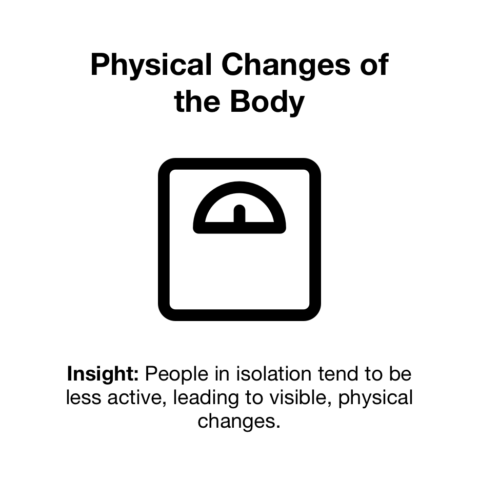
- The link between physical activity and mental well-being is clear. Studies have shown that enforced sedentary behaviour has led to depressive feelings and low moods in healthy people within seven days
- Exercise improves mental health by reducing anxiety, depression, and negative mood and by improving self-esteem and cognitive function. Exercise has also been found to alleviate symptoms such as low self-esteem and social withdrawal
- Since 2013, millennials have seen a 47% increase in major-depression diagnoses, according to Harvard Medical School
"How might we help millennials increase their physical activity during COVID-19 in order to actively regulate their mood, and improve their mental health and wellness?"
Market Research
I did a competitor analysis so I could get a better understanding of the market. I found that alot of these companies really focussed on fitness or mental health but none of them focussed on both, and the sole company that did, didn’t really offer any variation in types of physical activity. I found that these were very interesting areas of opportunity to explore.
Primary Research Method
To gain some insights about my users, I conducted a series of 5 interviews over Zoom with Millennials recruited from my professional network.
Interview Criteria:
- Age 23-38
- Physically active and enjoy physical activity
DEFINE
.
User Interviews
From the 5 interviews I was able to organize my interview notes into Pain Points, Behaviours and Motivations. From there I synthsized those interview notes into 4 reocurring themes and insights.
Interview Notes
Themes and Insights

Chosen Theme
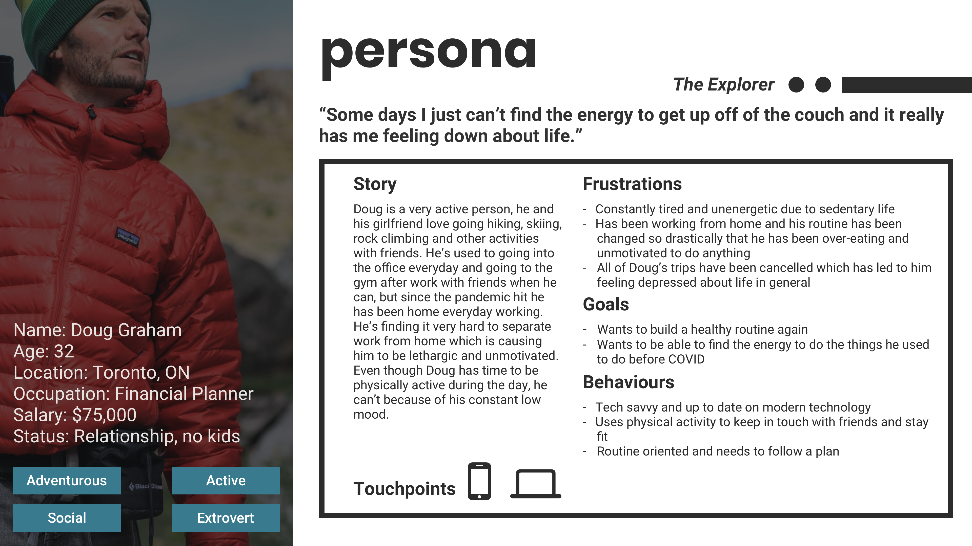
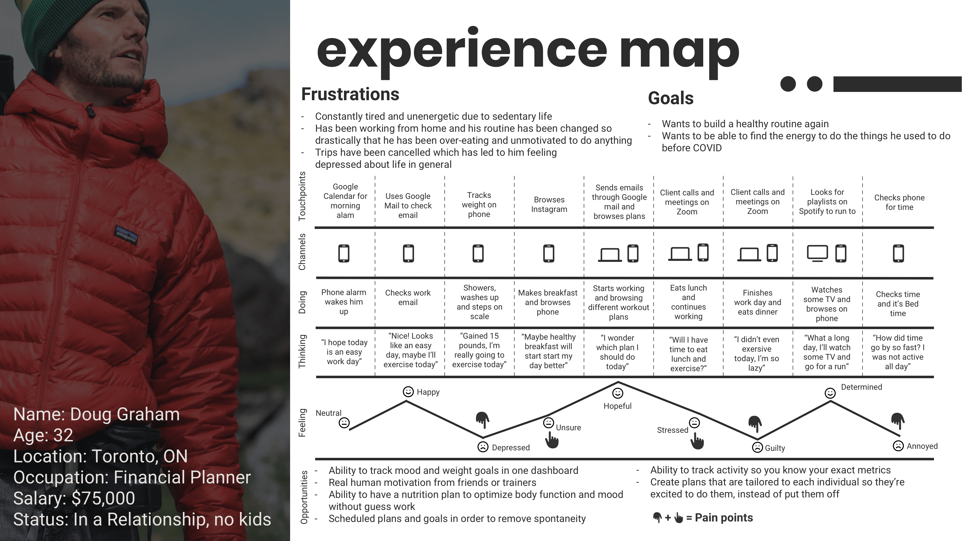
Persona & Experience Map
Once I finished synthesizing my interview insights, I was able to get a better sense of my users needs and experieinces. I crafted a persona that drove human-centered design decisions and an experience map to portray his journey. This allowed me to identify potential opportunities for intervention.
Opportunities for Intervention
Based on my interviews and persona development, I was able to get a clear understanding that most of my users prefered alternate forms of physical activity. They found it hard to get motivated for just exercising on their own but would much rather take part in activities where they're learning a skill or doing trying something new. This realization lead me to pivot my "How Might We" question.
"How might we use Millennials’ increased interest in non-traditional types of physical fitness to increase their activity during COVID-19, in order to actively regulate their mood, and improve their mental health and wellness?"
DEVELOP
.
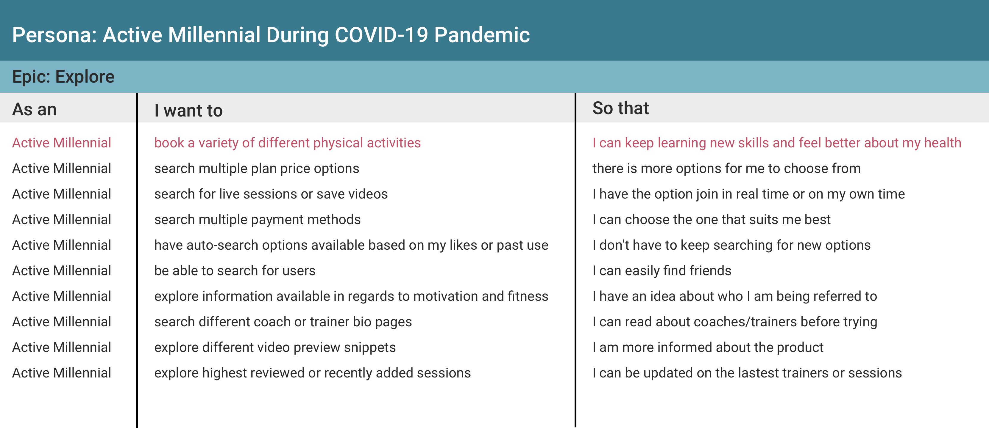
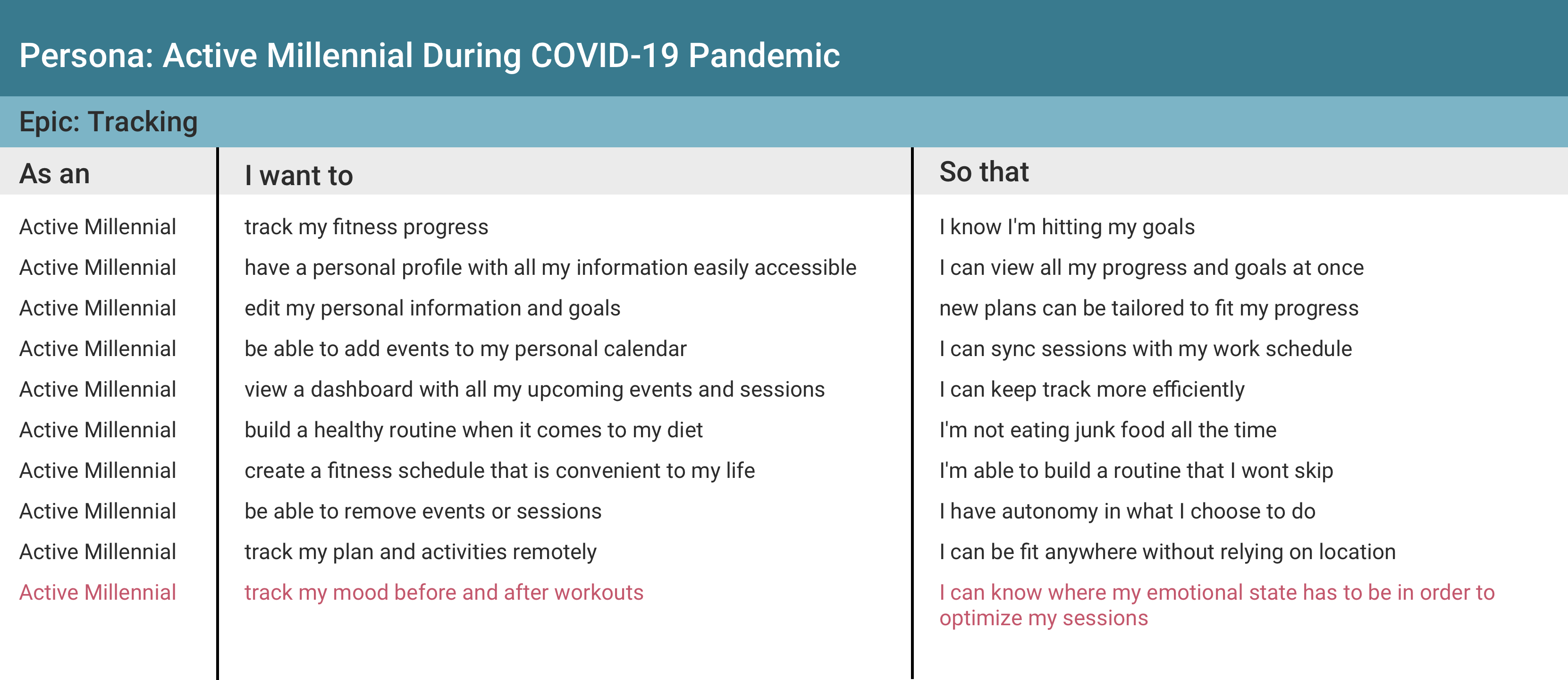
Epic #1
Explore
Epic #2
Tracking
Task #1
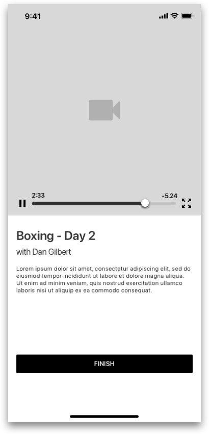
Booking a new physical activity from the explore page.
Task #2
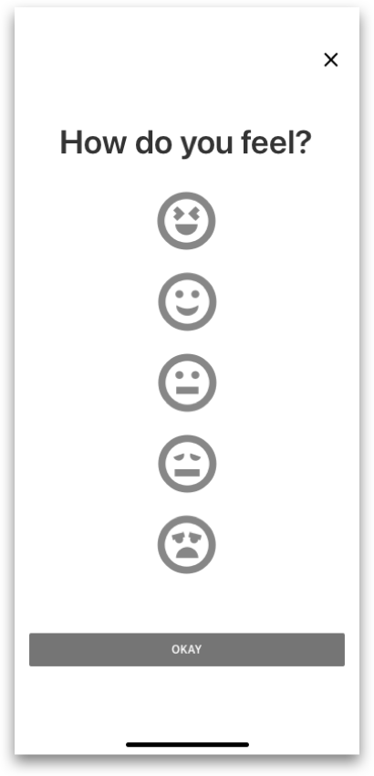
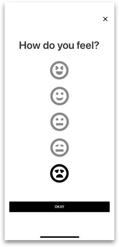
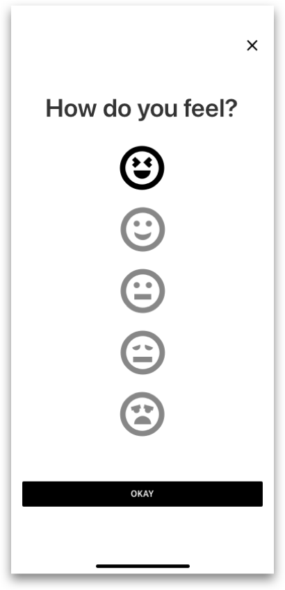
Completing an activity, and checking personal mood tracking charts.
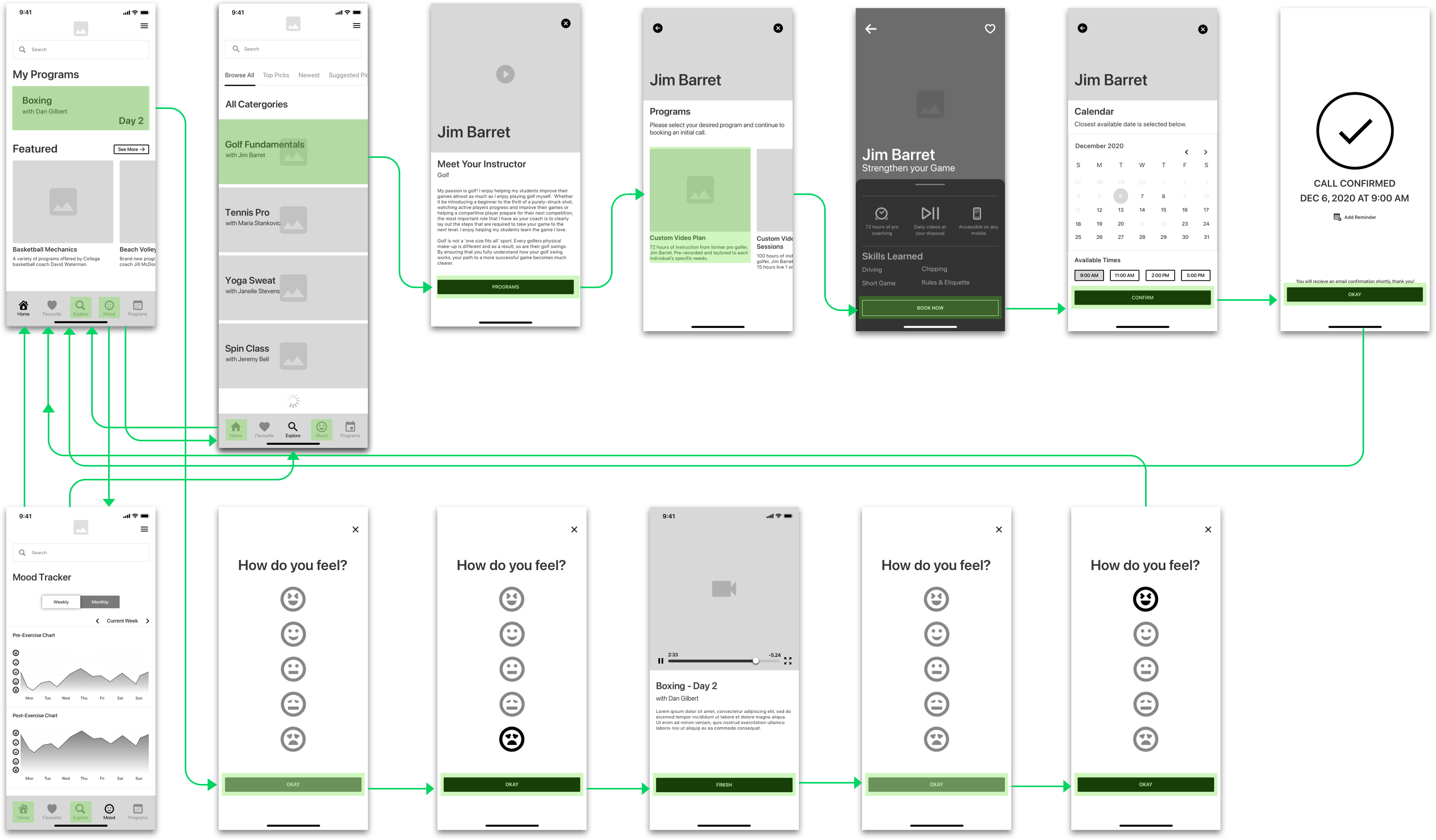
Once I finished identifying my main tasks from my user stories, I developed 2 task flows analyzing how my users would interact with the product, constantly referring back to my persona Doug, to drive my decisions.
The primary task flow outlines how a user like Doug would find and book am instructor from the explore page. The secondary task flow shows how Doug can complete a workout, and record his mood before and after the activity to keep statistics on his general mental health.
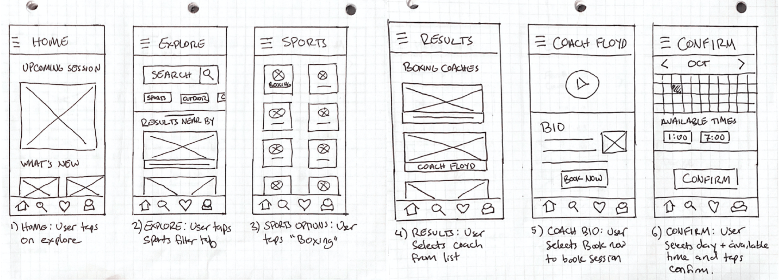
Concept Sketches
After developing my Primary and Secondary task flows, I began to sketch different concept designs on paper. I came up with a variety of paper sketch concepts that I was able to synthesize into final sketches for wireframing.
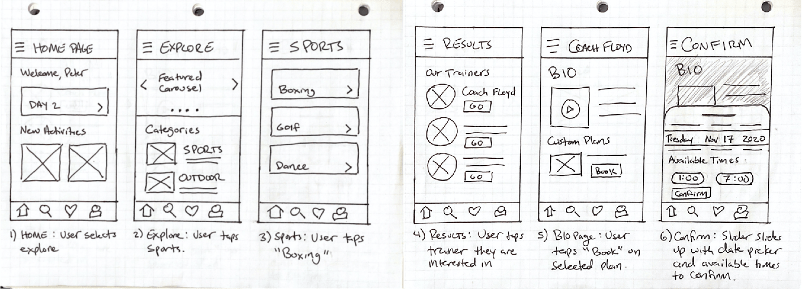
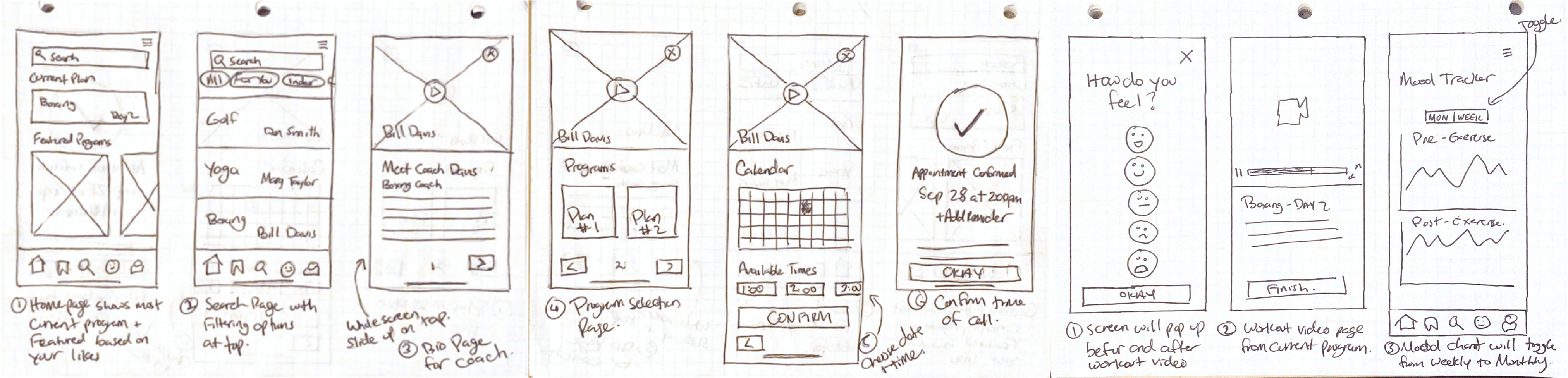
Wireframes - Version 1
After developing my Primary and Secondary task flows, I began to sketch different concept designs on paper. I came up with a variety of paper sketch concepts that I was able to synthesize into a final sketches for wireframing.


User Testing - Round 1
After developing my mid-fidelity wireframes in greyscale, I stitched the screens together for 2 rounds of usability testing. Overall, I tested 5 participants each round for a total of 2 rounds and 10 participants. The participants were given set tasks to complete as I watched them navigate the app.
Notable Iterations
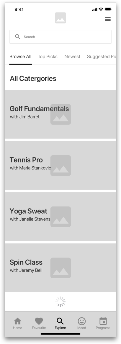
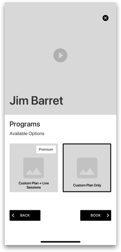
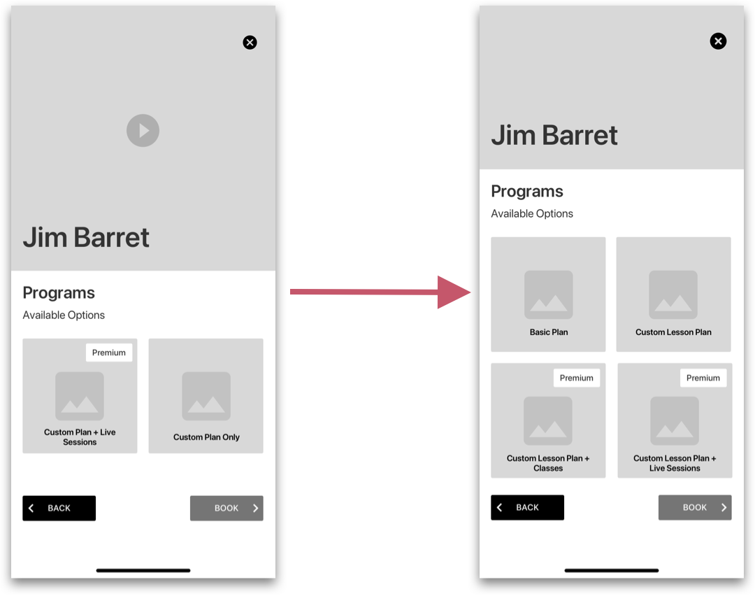
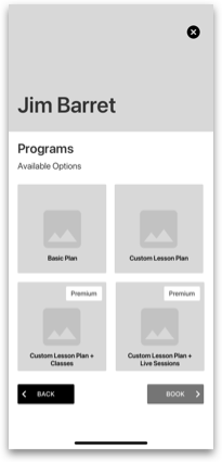
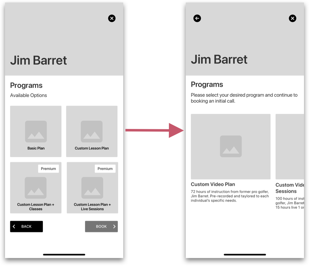
- For the first change, users want to know more information about the plans offered. I chose to include more plans so users can compare and contrast each plan for more information.
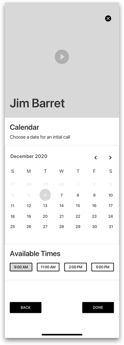
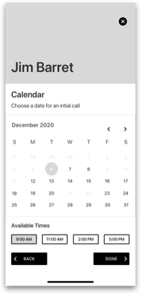
- Users were unable to see the available times section of the screen because it didn’t look scrollable, and having a video on each page seemed redundant.
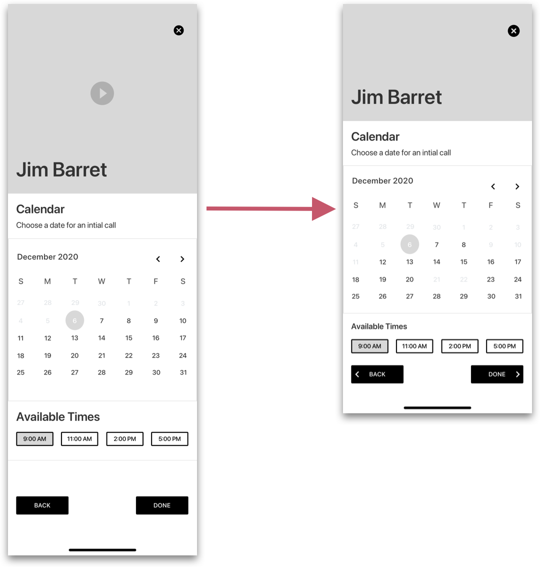
Wireframes - Version 2
After using the feedback gathered from the first 5 participants, I made the high impact chnages necessary for round 2 of usability testing. 5 more participants were testing using the same tasks as the previous 5.
User Testing - Round 2
Notable Iterations
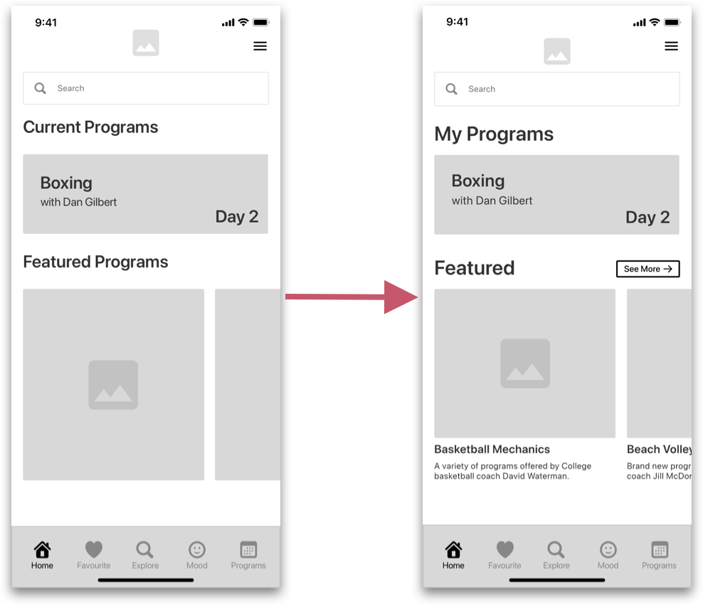
- Some users mentioned that having more information on the featured page would be beneficial, as well as a button that will let you “See More”.
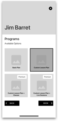
- The addition of more cards with more programs did not really solve the original problem of knowing more information about each program. As well as there was to much clicking on one page in order to progress, clicking to select and then to proceed was inefficient.
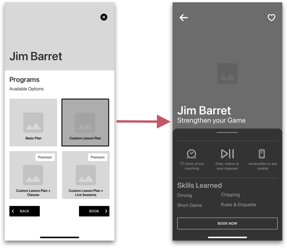
- It was mentioned by some users that they would like to be taken to a new screen with in depth program details so they know what they're getting.
Mid-Fidelity Wireflow
Using the feedback from rounds 1 and 2 of user testing, I was able to make final iterations on my wireframes to create the final mid-fidelity wireflow. This wireflow was used to design the high-fidelity version.
DELIVER
.
Visual Identity
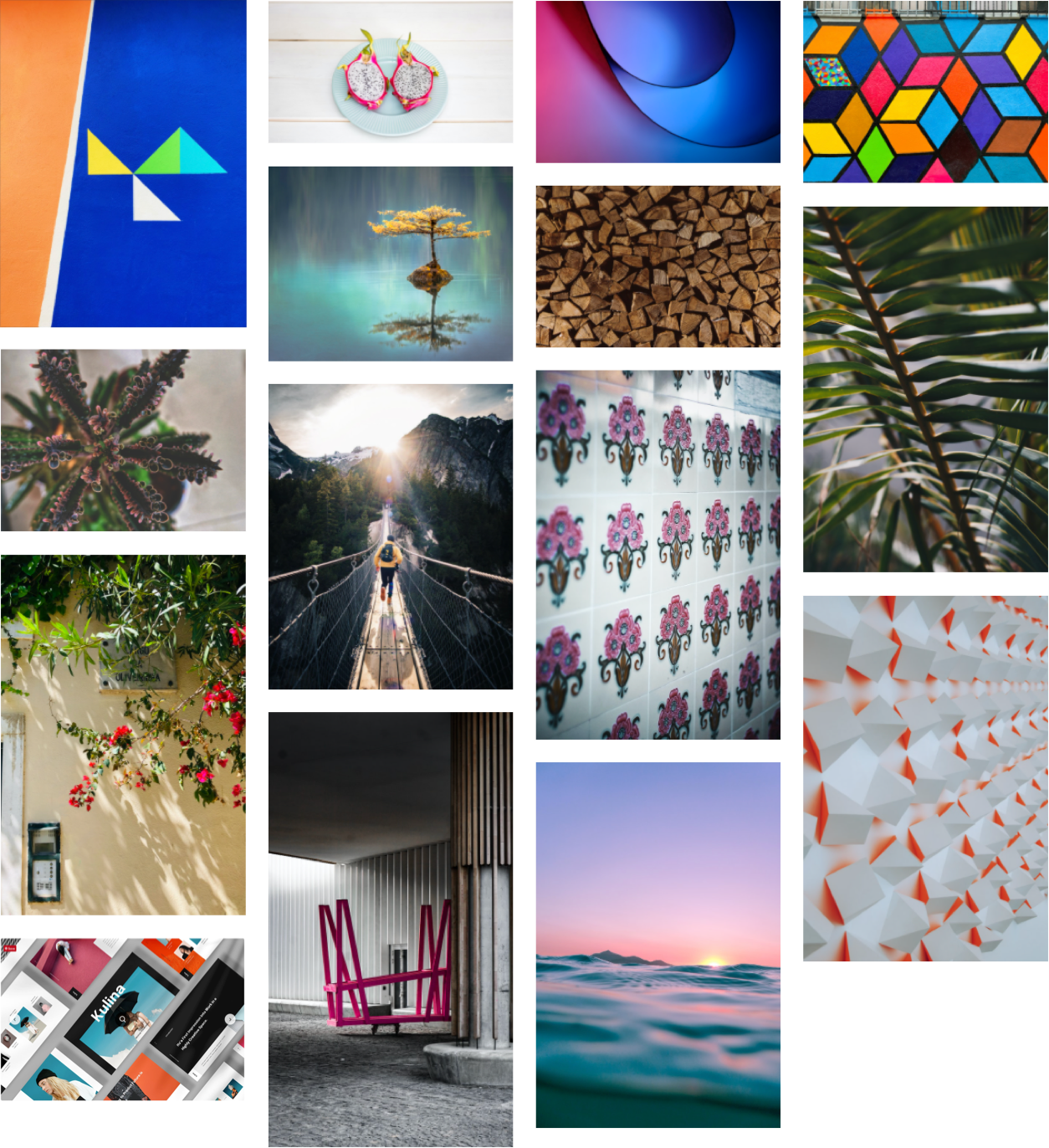
Now that I determined the final greyscale wireflow, I began to think about what the brand embodies. I started by brainstorming some words that I wanted the brand to personify. Once I came up with the 6 words I felt were important to my brand, I curated a visual moodboard for inspiration.
Brand Colours
After extracting colours from my moodboard I chose Ocean Blue, Coral and White as my main brand colours (60% White, 30% Blue and 10% Coral). The reason I chose these colors has a lot to do with what the brand represents. Since it is a fitness product that inspires mental wellness, I was looking for things that were calm, but relentless and persistent. The ocean was the first thing that came to mind. The ocean can be the very calming, but also continuous and persistent, which is how I want my users to look at phyisical fitness.

#397A8E
rgb(57,122,142)

#C5576B
rgb(197,87,107)

#FFFFFF
rgb(255,255,255)
Typography
This product is designed as a native iOS product. I chose to use the SF Pro Display font family because it has a very clean, sans serif typeface, and it follows Apple's Human Interface Guidelines.
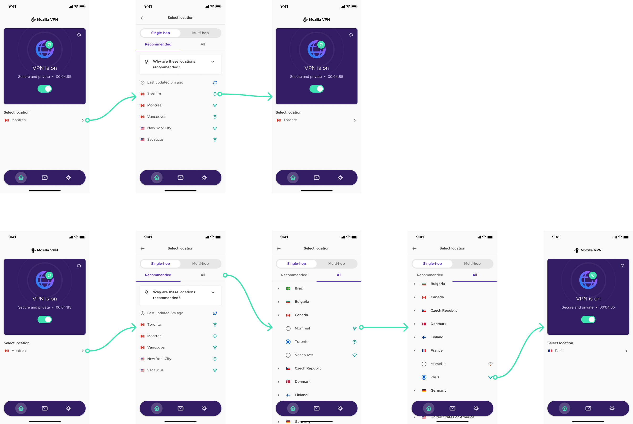
If you want to learn more about the design decisions behind Zenfit's UI components, you can take a look at Alliance - Zenfit's Design System. You can also check out Zenfit's UI Library.
Design System UI Library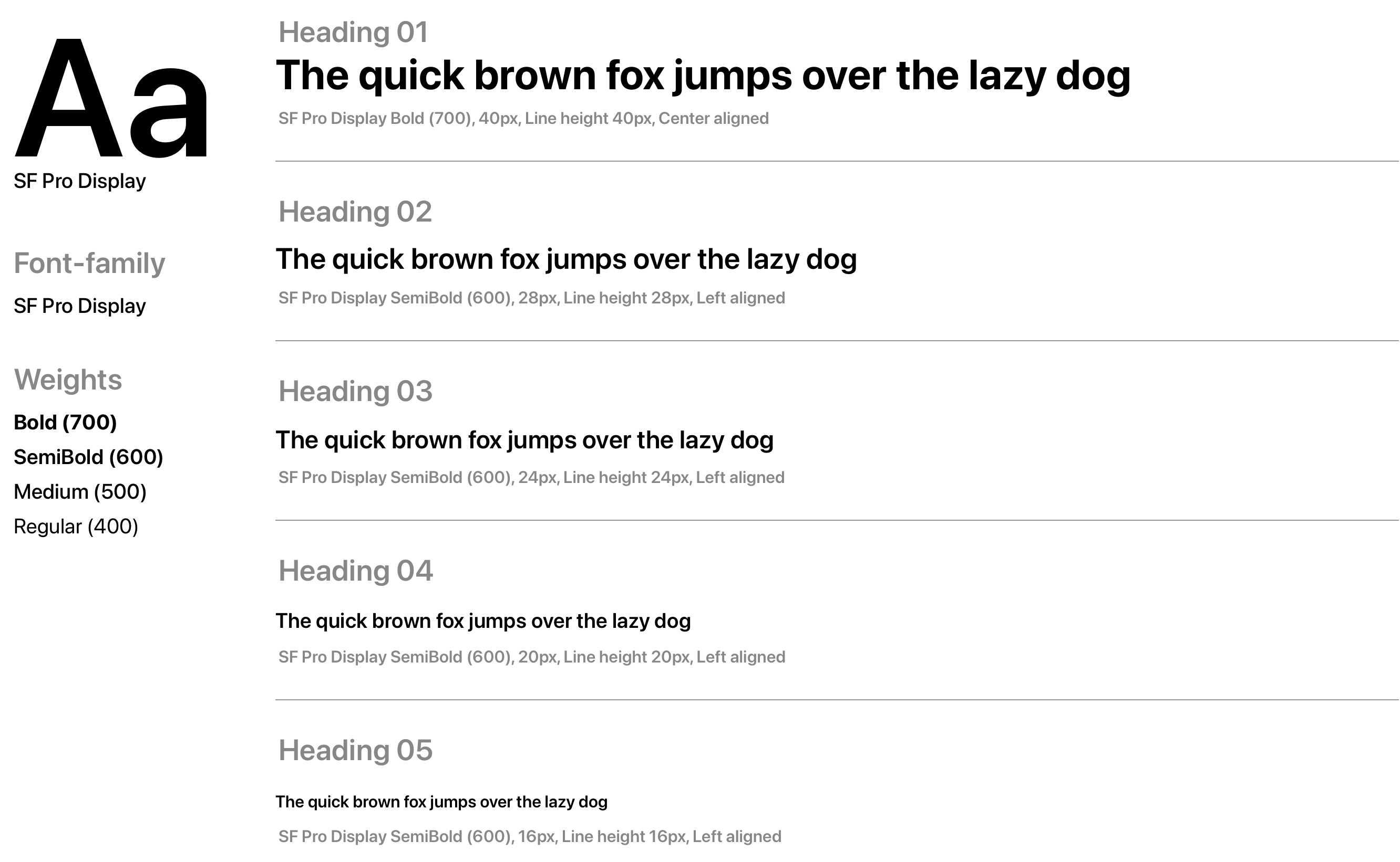
Logo Development
When developing the app name I wanted to incorporate one of the words I chose to represent my brand. I wanted my users to know that this was a fitness app so I stuck with consistency and standards, and included the word "fit".
After trying a few different variations of the name, I landed on "Zenfit" which I believed embodied the true essence of the brand. The lotus flower was something I wanted to include because it symbolizes the purity of heart and mind, and represents long life.
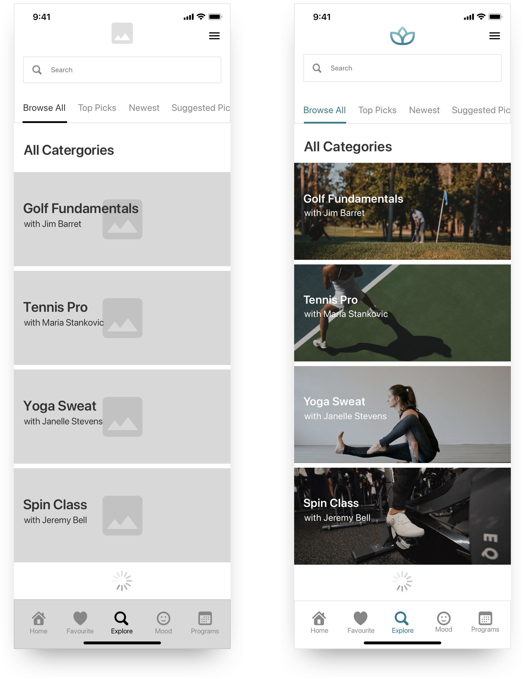
Colour Injection
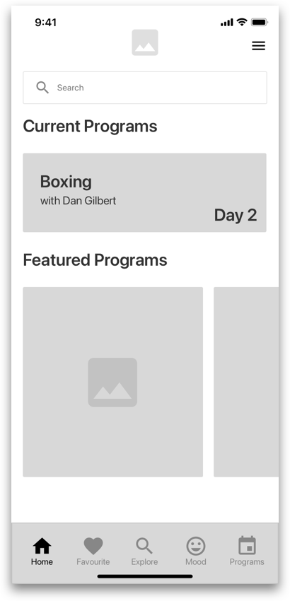
Since this is a fitness app at it's core, it was always going to be very image heavy and minimal. I decided to inject colour very carefully and minimally because I wanted the UI to stay consistent with other fitness apps on the market. I started with the explore page and then moved on from there.
Going back to my user testing, users mentioned that images and videos were what motivated them to click on results, so I made sure to have dynamic imagery on the explore page. I chose a minimal white background because I didn't want too much colour to take away from the main images.
Product Marketing Site
After completing the high-fidelty prototype, I began to think about how to share my brand story with my users.
I designed and built a fully responsive product marketing site with HTML, CSS and JavaScript. The site is responsive to all viewports (Desktop, Mobile and Tablet) using Bootstrap. I designed and customized the website using responsive, mobile-first design principles.
View Site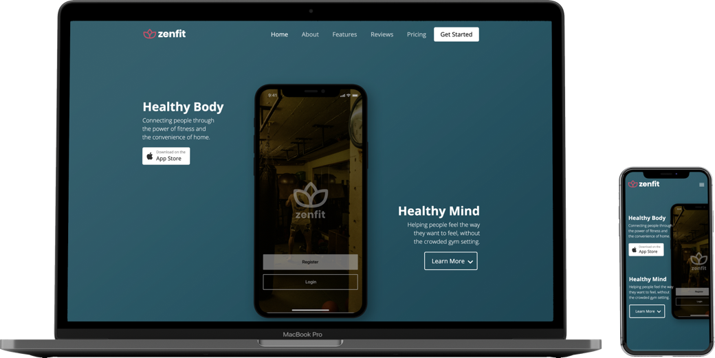
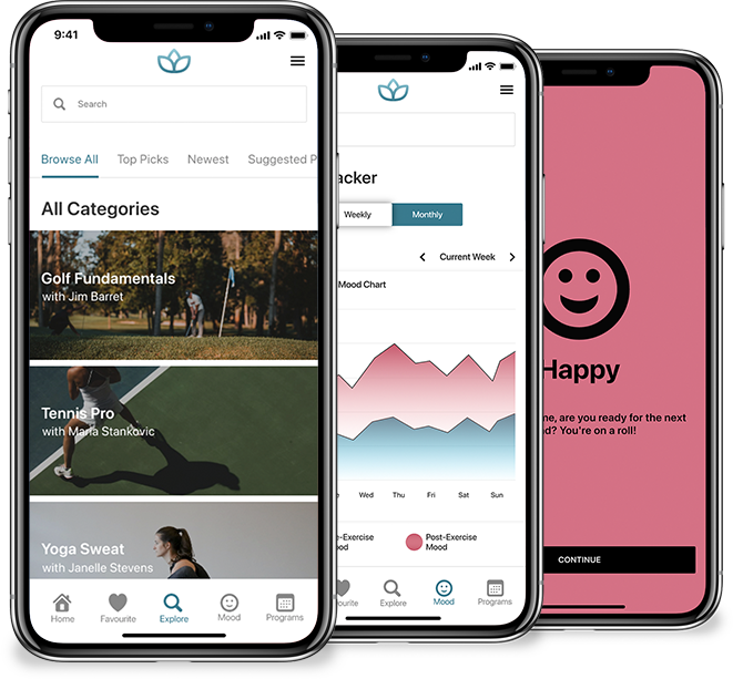
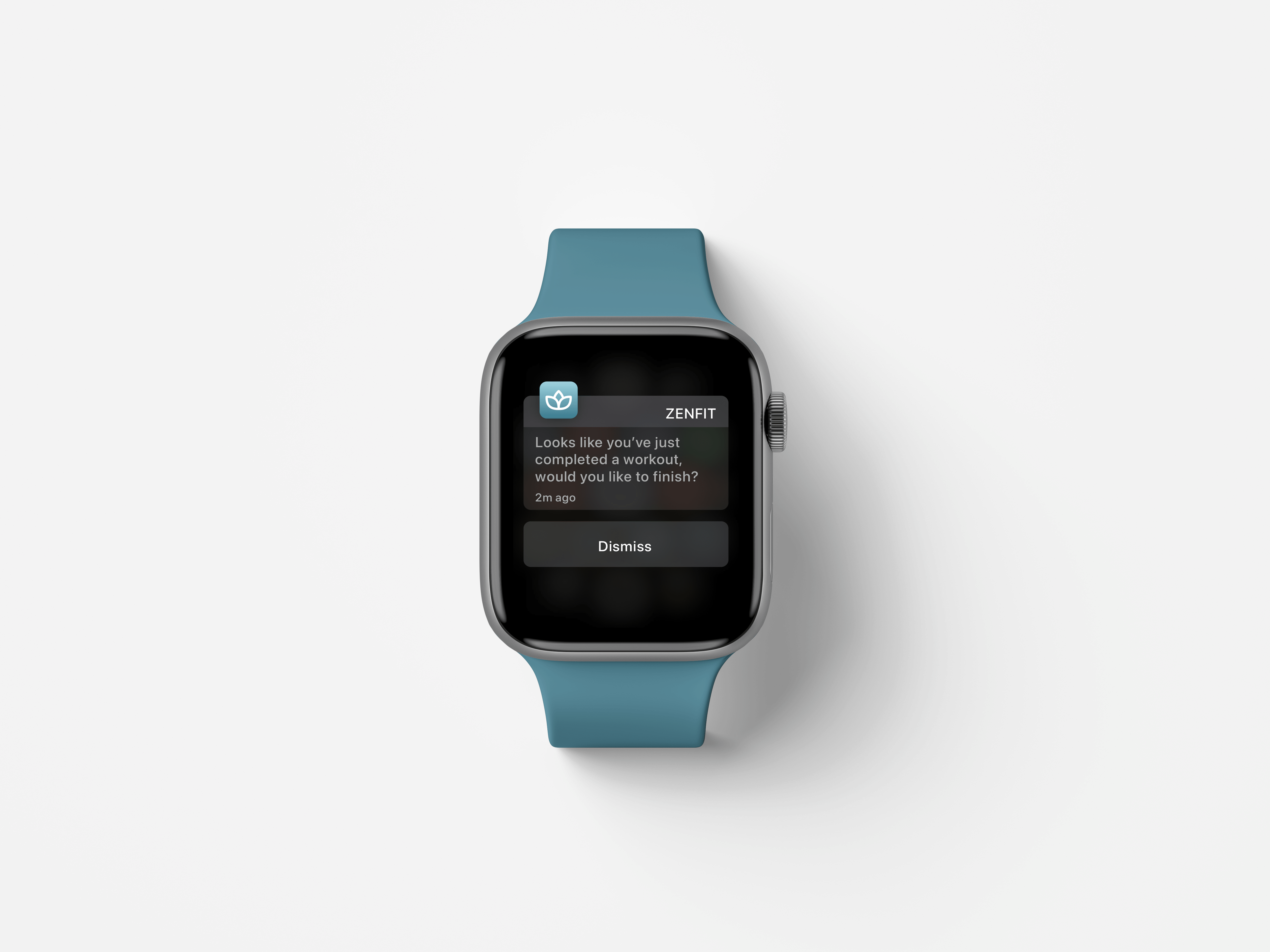
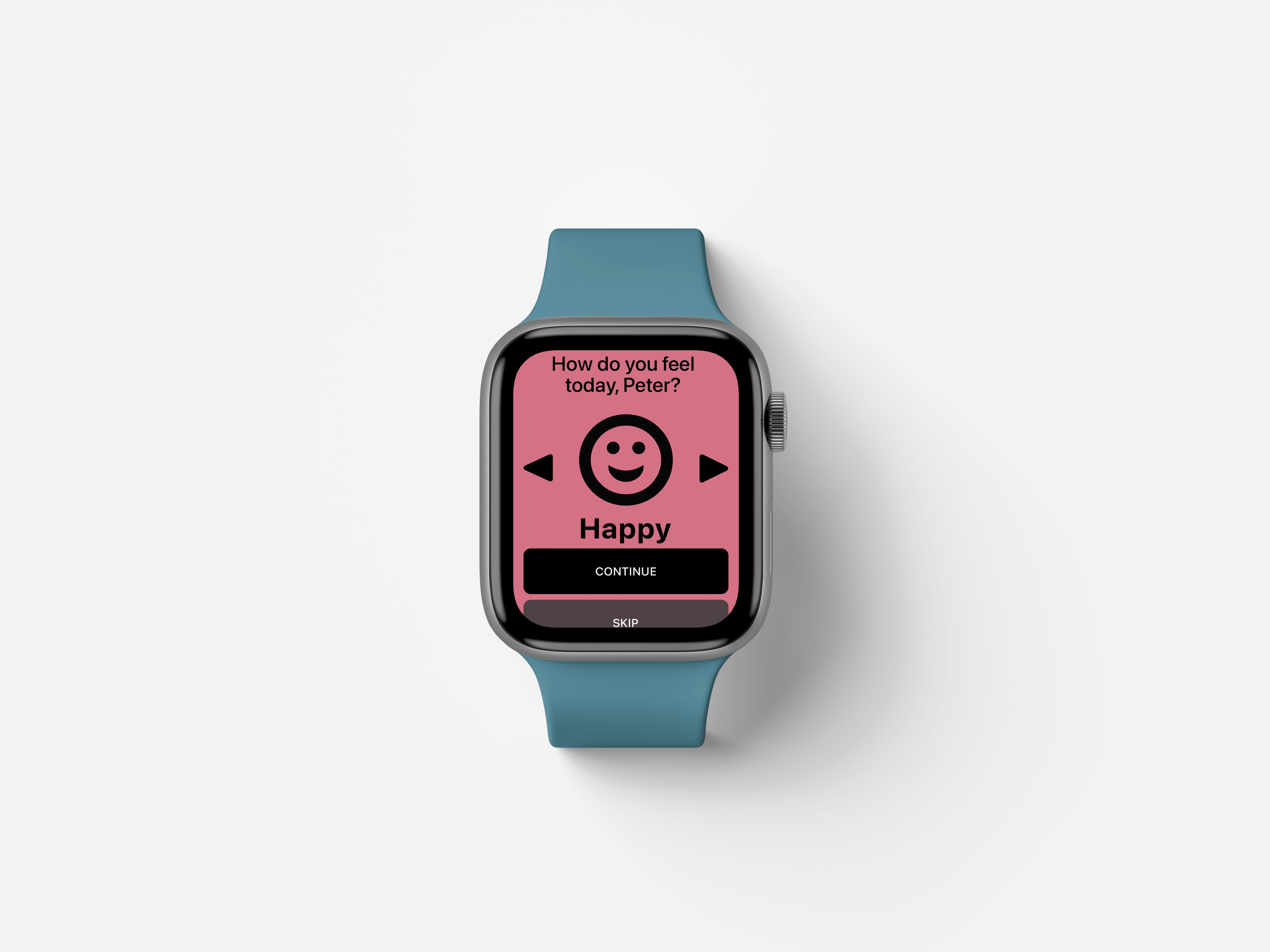
Multi-Platform Design
After developing the marketing website, I began to think about the business side of launching the app, the value proposition and how the app could survive and sustain long term.
Going back to my user testing and interviews, most of the participants used fitness apps on their apple watches or fitbits. Since Zenfit is a native iOS app, integrating it into the apple watch as a feature would be the next logical step.
What's Next?
I think there can be alot more to flesh out of this product. I've spoken with a psychotherapist about the idea and he gave me some valuable insights on potential features to build out for mental health tracking and statistics. Some things to consider:
- More research and testing on new features for the product. Maybe start building out the programs and favourites page views.
- I wanted there to be a social aspect to the app as well, I think fully exploring how that might look could be a interesting area of opportunity to look at, but again would require more research and testing.
- Finally, once all necessary screens and functionalities have been developed, I think a functioning MVP would be ideal to launch and test within a small group of people.
Key Learnings
Throughout the entirety of this project, I've gained countless pieces of knowledge, that I'm able to apply to future projects. Here are some of the most notable key learnings:
- The importance of knowing your project constraints can’t be overlooked. During testing you’ll find a lot of conflicting feedback, or feedback that just doesnt have a high impact. In order to satisfy your constraints you must discover what low to moderate effort changes are easy to implement and start from there.
- It’s extremely important to always refer back to your users to drive your design decisions. Whether it be your user testing, persona or journey map. It’s important to remember that your users are who you design for, not yourself.
- It’s sometimes hard to hear negative feedback about work you’ve put alot of time and effort into. Learning to take feedback, offer feedback and iterate on what’s important to your users without getting too attached, is an important skill.

Not All Feedback is Good Feedback

Always Think About Your Users

Don't Get too Attached to Your Designs
LET'S CONNECT
.